This chapter is excerpted from SitePoint’s HTML Utopia: Designing Without Tables Using CSS, Second Edition, which provides a complete introduction to CSS and shows you how to build rock-solid CSS-based web sites from scratch. By the end of the book’s 12 chapters, you’ll understand the ins and outs of CSS, and you’ll be able to create robust, standards-compliant site designs that degrade gracefully in older browsers and are easy to maintain.
You can download this chapter in PDF format, along with the first three chapters of the book, if you’d prefer to read it offline. Now, let’s get started building your CSS-based page layout!
We now have some sound theory under our belts. The rest of this book will concentrate on how you can put CSS into practice when developing your own sites. Along the way, we’ll be learning how to lay out pages using CSS – moving from simple layouts to more complex ones – and how you can combine some of the concepts you’ve already read about to create great-looking sites.
This chapter will start with the creation of a simple two-column layout. Along the way, we’ll discover how to use absolute and relative positioning, and see how margins, padding, and borders work together. Then, we’ll get an understanding of how all these tools can be used together in practice by creating a two-column layout that uses many of the techniques we have discussed already in this book.
While the layout we’ll create in this chapter is a relatively simple one, it’s a structure that’s used by many web sites; the layout we’ll develop here could easily form the basis for a production site.
The Layout
Many web site designs start life as mock-ups in a graphics program. Our first example site is no exception: we have an example layout or “design comp” created in Fireworks as a starting point.
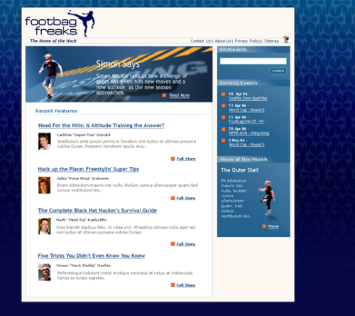
Figure 8.1. Creating the layout as an image file
Starting out with a visual like this enables us to think about the way we’re going to build the site before we start to write any XHTML or CSS. It gives us the opportunity to decide how best to approach this particular layout before we code a single line.
This layout divides the page into three main sections: a header, which contains the site logo and some main navigation; a main content area comprising a large image above a list of news stories; and a sidebar, which presents some additional items.
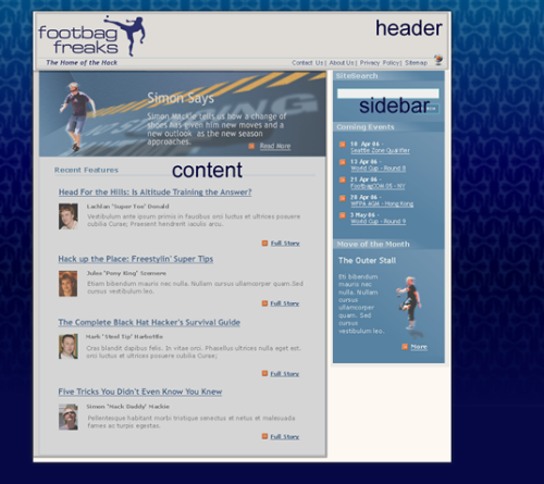
Figure 8.2. Marking the main sections on the layout
This layout could be described as a two-column layout with a header area. Being able to visualize a design as being a combination of its main sections eases the process of deciding how to approach the page layout.
Creating the Document
Having decided what the basic components of our page will be, we can start work. The first thing we’ll do is create an XHTML document that contains all of the text elements we can see in our layout image, marked up using the correct XHTML elements.
Working this way might seem a little strange at first, particularly if you have been used to working in a visual environment, such as Dreamweaver, and simply concentrating on how the design looks. However, one of the advantages of using CSS for layout is that we’re able to separate the structure of the page from its appearance. This allows us to concentrate on building a good solid document as the basis of our site, before adding the design using CSS.
We start out with the basic requirements for an XHTML Strict document. As we’re going to use CSS for all of the presentational information on this site, there’s no reason not to use a Strict DOCTYPE. The Transitional DOCTYPEs (for both XHTML and HTML 4.01) allow you to use attributes and elements that are now deprecated in the W3C Recommendations. The deprecated elements and attributes are mainly used for presentation, and as we’re going to use CSS – not XHTML – for presentation, we won’t need to use these anyway.
Example 8.1. index.html


<!DOCTYPE html PUBLIC "-//W3C//DTD XHTML 1.0 Strict//EN"

    "https://www.w3.org/TR/xhtml1/DTD/xhtml1-strict.dtd">

<html xmlns="https://www.w3.org/1999/xhtml">

  <head>

    <title>Footbag Freaks</title>

    <meta http-equiv="Content-Type"

        content="text/html; charset=iso-8859-1" />

  </head>

  <body>

  </body>

</html>
Declaring the Character Set
In our pages, we’ve used the meta element with the http-equiv="Content-Type" attribute to declare our document’s character set. This makes it easy for browsers (and the W3C validator) to determine which character set is being used in the document. If this information was missing, a browser could misinterpret the characters in your page, which could see your pages rendered as unintelligible garbage.
All of the examples in this book use ISO-8859-1 encoding, which is the default for most popular text editors and programs such as Dreamweaver. If you’re dealing with a different character set, such as Unicode, you’ll need to change the meta elements accordingly.
The Header
Let’s start to add the content of this page to our document. As we do so, we’ll split it up into the various sections identified above, containing each page section between <div> and </div> tags. We’ll give each div an id to identify that section; we’ll use these ids to address each section and style it using CSS.
After the <body> tag, add the following markup:
Example 8.2. index.html (excerpt)


<div id="header">

  <p>The Home of the Hack</p>

  <ul>

    <li><a href="">Contact Us</a></li>

    <li><a href="">About Us</a></li>

    <li><a href="">Privacy Policy</a></li>

    <li><a href="">Sitemap</a></li>

  </ul>

</div> <!-- header -->
We won’t worry about any image elements at this point, because there are numerous ways in which we can add images to the page using CSS; we’ll make the decision as to the best way to add each image as we create our CSS. Thus, the header area simply contains the tag line, “The Home of the Hack,” and a list that includes the main navigation links.
The Main Content Section
The main content section comes next, contained in a div with an id of content:
Example 8.3. index.html (excerpt)


<div id="content">

  <h2>Simon Says</h2>

  <p>Simon Mackie tells us how a change of shoes has given him new

      moves and a new outlook as the new season approaches.</p>

  <p><a href="">Read More</a></p>

  <h2>Recent Features</h2>

  <ul>

    <li>

      <h3>Head for the Hills: Is Altitude Training the

          Answer?</h3>

      <p>Lachlan 'Super Toe' Donald</p>

      <p>Vestibulum ante ipsum primis in faucibus orci luctus et

          ultrices posuere cubilia Curae; Praesent hendrerit

          iaculis arcu.</p>

      <p><a href="">Full Story</a></p>

    </li>

    <li>

      <h3>Hack up the Place: Freestylin' Super Tips</h3>

      <p>Jules 'Pony King' Szemere</p>

      <p>Vestibulum ante ipsum primis in faucibus orci luctus et

          ultrices posuere cubilia Curae; Praesent hendrerit

          iaculis arcu.</p>

      <p><a href="">Full Story</a></p>

    </li>

    <li>

      <h3>The Complete Black Hat Hacker's Survival Guide</h3>

      <p>Mark 'Steel Tip' Harbottle</p>

      <p>Vestibulum ante ipsum primis in faucibus orci luctus et

          ultrices posuere cubilia Curae; Praesent hendrerit

          iaculis arcu.</p>

      <p><a href="">Full Story</a></p>

    </li>

    <li>

      <h3>Five Tricks You Didn't Even Know You Knew</h3>

      <p>Simon 'Mack Daddy' Mackie</p>

      <p>Vestibulum ante ipsum primis in faucibus orci luctus et

          ultrices posuere cubilia Curae; Praesent hendrerit

          iaculis arcu.</p>

      <p><a href="">Full Story</a></p>

    </li>

  </ul>

</div> <!-- content -->
This area will contain the large image with a text overlay that highlights a feature story. Four news items will be listed below this.
The Sidebar
Finally, let’s add the sidebar, which contains a search box and some important dates:
Example 8.4. index.html (excerpt)


<div id="sidebar">

  <h3>Site Search</h3>

  <form method="post" action="" id="searchform">

    <div>

      <label for="keywords">Keywords</label>:

      <input type="text" name="keywords" id="keywords" />

    </div>

    <div>

      <input type="submit" name="btnSearch" id="btnSearch" />

    </div>

  </form>

  <h3>Coming Events</h3>

  <ul>

    <li>10 Apr 06 -<br /><a href="">Seattle Zone

        Qualifier</a></li>

    <li>13 Apr 06 -<br /><a href="">World Cup - Round 8</a></li>

    <li>21 Apr 06 -<br /><a href="">FootbagOOM 05 - NY</a></li>

    <li>28 Apr 06 -<br /><a href="">WFPA AGM - Hong Kong</a></li>

    <li>3 May 06 -<br /><a href="">World Cup - Round 9</a></li>

  </ul>

  <h3>Move of the Month</h3>

  <h4>The Outer Stall</h4>

  <p>Eti bibendum mauris nec nulla. Nullam cursus ullamcorper

      quam. Sed cursus vestibulum leo.</p>

  <p><a href="">more</a></p>

</div> <!-- sidebar -->
This completes our markup for the homepage of the site. Save your page and view it in your browser. The content of your document will display using the default styles for the elements that we’ve used, as Figure 8.3 illustrates. It won’t be pretty, but it should be easily readable!
Our last job before we start to add the CSS that will create the design we see in the example graphic is to validate our markup. By validating the document at this point, we’ll know that we’re adding CSS to a valid document: we won’t come up against problems caused by existing invalid markup.
Figure 8.3. Displaying the page after the content is added
Positioning the Page Elements
We can now begin to create our style sheet. But, before we do, we need to take a moment to understand some basic concepts that come into play when creating layouts such as this (and many others): the display property, the concept of positioning, and the CSS Box Model technique.
The display Property
Before we can move on to look at CSS positioning issues, we should take a quick look at the display property, as it can have a significant impact on page layout.
The display property determines how a browser displays an element – whether it treats it as a block, an inline text fragment, or something else. Although it can be assigned any of 17 legal values, browser support realities confine the list to six, only four of which are really important. For a full reference to display see Appendix C, CSS Property Reference.
The six possible values for the display property are:
blockinlinelist-itemnonetable-footer-grouptable-header-group
The default value varies from element to element. Block elements such as p, h1, and div default to block, while inline elements (those that would normally occur within a section of text ), such as strong, code, and span, default to inline. List items default to list-item. Assigning non-default settings to elements can produce interesting and useful effects. Later in this book, we’ll see how we can use display: inline to cause a list to display horizontally.
If you supply a value of none, the element to which it applies will not display, and the space it would normally occupy will be collapsed. This differentiates the display: none declaration from the visibility: hidden declaration, which is commonly used to hide an element but preserve the space it would occupy if it were visible.
Absolute, Relative, and Positioning Contexts
The CSS position property takes on a single, constant value that determines how the block is positioned on the page. The two most frequently used values are absolute and relative. Another value, static, is the default value for this property; the fourth value, fixed, is not supported by Internet Explorer 6.
Positioning in CSS can be confusing because the points that are referenced to guide a block’s placement on the page change in accordance with the positioning context of the block. There’s no universal set of coordinates to guide placement, even when you’re using the absolute positioning value. Each time a block is positioned on the page with a position setting other than static, it creates for its descendants a new positioning context in which the upper left corner of its content area has the coordinates (0,0). So, if you use CSS to position an element within that block, its position will be calculated relative to that new coordinate system – its “positioning context.”
The best way to understand this concept is to look at a few simple, interrelated examples. Let’s start with a blank page. In this context, the upper left corner of the viewport – the viewable area of the browser window – is where the initial (0,0) coordinates are located. Let’s place a simple piece of text in a div, as shown in Figure 8.4.
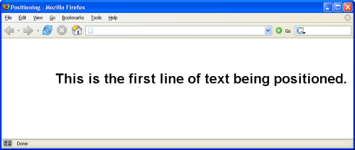
Figure 8.4. The first line of text
Here’s the HTML fragment that produces the result shown above. The CSS properties top and left are used to position the div on the page, locating it 75 pixels from the top of the page, and indenting it from the left of the page by 125 pixels:
Example 8.5. positioning.html (excerpt)


<div style="position: absolute; left: 125px; top: 75px;"

    class="big">

  This is the first line of text being positioned.

</div>
Now, put a second div inside the first one, as shown here:
Example 8.6. positioning.html (excerpt)


<div style="position: absolute; left:125px; top: 75px;"

    class="big">

  This is the first line of text being positioned.

  <div style="position: absolute; left: 25px; top: 30px;"

      class="big">

    This is a second line.

  </div>

</div>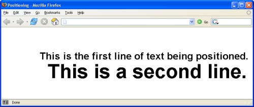
Figure 8.5. An element positioned inside a positioned block
The result is shown in Figure 8.5. Notice that the second line of text is indented 25 pixels from the left of the first line of text, because that first line sets the positioning context for the second: it’s the parent element of the second line. Both lines are positioned absolutely; however, the first line is positioned from the top and left of the viewport, and the second line is positioned absolutely from the top and left of the first. Notice, too, that its font size is huge. Why? Take a look at the style rule for the big class, and you’ll understand:
Example 8.7. positioning.html (excerpt)


.big {

  font-family: Helvetica, Arial, sans-serif;

  font-size: 2em;

  font-weight: bold;

}
As the second div is a child of the first, its font size is calculated relative to that of the first div. The style rule defines the font as being of size two ems, which instructs the browser to render the text at twice the size it would otherwise appear. When that two em rule is applied to the first line, its size is doubled. But when it is applied to the second line, the font size of the first line is doubled to calculate that of the second.
We can correct this using an absolute font size constant:
Example 8.8. positioning.html (excerpt)


.big {

  font-family: Helvetica, Arial, sans-serif;

  font-size: large;

  font-weight: bold;

}
The two divs should now share the same font size.
The page now has two div elements, one nested inside the other. Both use absolute positioning. Now, let’s add a third element – this time, a span element that will be contained in the second div. Using relative positioning, the HTML looks like this:
Example 8.9. positioning.html (excerpt)


<div style="position: absolute; left: 125px; top: 75px;"

    class="big">

  This is the first line of text being positioned.

  <div style="position: absolute; left: 25px; top: 30px;">

    This is <span

        style="position: relative; left: 10px; top: 30px;">an

        example of</span> a second line.

 </div>

</div>
The result of this markup can be seen below. Notice that the words “an example of,” which are contained in the span, appear below and slightly to the right of their original position. Relative positioning is always based on the positioned element’s original position on the page. In other words, the positioning context of an element that uses relative positioning is provided by its default position. In this example, the span is positioned as shown in Figure 8.6. It appears below and to the right of where it would normally be if no positioning was applied – a case that’s illustrated in Figure 8.7.
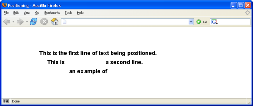
Figure 8.6. Example of relative positioning
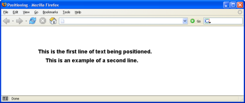
Figure 8.7. The same example with the positioning removed
Don’t worry if this concept still seems a bit confusing; we’ll be looking at how these concepts work in practice as we create our layouts.
The Box Model
From the perspective of a style sheet, every item you deal with in an HTML page can be viewed as existing inside a box. This fact is generally far more obvious when you’re formatting large chunks of content, like the three main page areas we’ve identified in our design. But it’s true even when you’re dealing with individual components of those elements, like headings, lists, list elements, and even segments of text.
The basic CSS box model is shown in Figure 8.8.
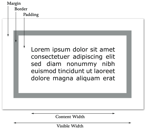
Figure 8.8. The basic CSS box model
At the center of the CSS box model is the content itself. Don’t think of this “content” as being the same as words or images that might comprise the content of a news story or a set of links. “Content” describes any item that’s contained within the area of the box.
Notice from the diagram that the visible width of the box is determined by adding together the content width, the padding, and the border. The margin determines the distance between each side of the visible box and adjacent elements. Similarly, the visible height of the box is determined by adding the height of the content to the padding and border settings. Once again, the margin determines how far the box will be separated from adjacent objects vertically.
The width of each of these elements – margin, border, and padding – can be set using four CSS properties (one for each side of the box), or a single shorthand property. Border behavior is slightly more complicated because, in addition to width, a border can have characteristics such as line style and color.
In this discussion, I’ll begin by explaining and demonstrating the use of padding in some detail. Then, I’ll move on to a discussion of margins, which will be briefer, as it’s so similar to padding. Finally, I’ll discuss borders.
For the next few sections, I’ll use a basic, single-box layout to demonstrate CSS rule techniques. It starts out as the layout shown in Figure 8.9, with no padding, border, or margin: the content is the same size as the box.
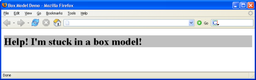
Figure 8.9. Starting point for the box model demonstration
I’ve given the h1 element a gray background so you can see more easily the impact of the effects I’ll be demonstrating. The HTML below produces the page shown in Figure 8.9:
Example 8.10. boxmodel.html


<!DOCTYPE html PUBLIC "-//W3C//DTD XHTML 1.0 Strict//EN"

    "https://www.w3.org/TR/xhtml1/DTD/xhtml1-strict.dtd">

<html xmlns="https://www.w3.org/1999/xhtml">

  <head>

    <title>Box Model Demo</title>

    <meta http-equiv="Content-Type"

        content="text/html; charset=iso-8859-1" />

    <style type="text/css">

      h1 {

        background-color: #c0c0c0;

        color: black;

      }

    </style>

  </head>

  <body>

    <h1>Help! I'm stuck in a box model!</h1>

  </body>

</html>
Throughout the rest of this discussion, I’ll be modifying only the style sheet information, so I’ll reproduce only that section of the code, indicating any changes in bold.
Pixels vs Percentages
As the box model deals with the display of content on the screen, the pixel is the most commonly used of the absolute measurement units in CSS. However, if you need to create a layout that takes up all of the available space, regardless of how big the browser window is, it’s necessary to use the percentages rather than pixels. Such layouts are characterized by their “stretchy” behavior – the page elements expand and contract proportionately as the user resizes the browser window.
Padding Properties
Four properties together define the padding around an object in a CSS rule: padding-left, padding-right, padding-top, and padding-bottom.
Let’s change just one of the padding settings to get a feel for how this works. Modify the style sheet in the sample file, so that it replicates the following fragment (remember that the new material is presented in bold text below):
Example 8.11. boxmodel.html (excerpt)


h1 {

  background-color: #c0c0c0;

  color: black;

  padding-left: 25px;

}
The result of this change is shown in Figure 8.10. Notice that the text now begins 25 pixels from the left side of the box, resulting in 25 pixels of blank, gray space to the left of the text.
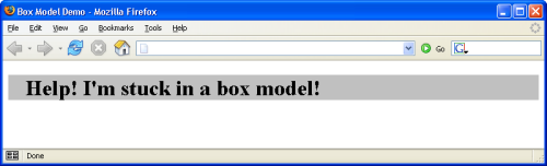
Figure 8.10. Demonstrating padding-left
As you’d expect, you can set the other padding sizes the same way, as this code fragment shows:
Example 8.12. boxmodel.html (excerpt)


h1 {

  background-color: #c0c0c0;

  color: black;

  padding-left: 25px;

  padding-top: 15px;

  padding-bottom: 30px;

  padding-right: 20px;

}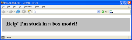
Figure 8.11. Defining all four padding properties
You can see the effects of these changes in Figure 8.11.
You may notice that the padding on the right-hand side appears not to have worked. You asked for 20 pixels, but no matter how wide you stretch the window, the gray area that defines the box containing our h1 element just goes on and on.
This is because padding-right creates a space between the right edge of the text and the right edge of the heading, as represented by the gray box. The spacing is difficult to see in this case, because the heading automatically spans the width of the browser window, leaving plenty of room for the text to breathe on the right-hand side. If you make the browser narrow enough, though, you can see the padding take effect.
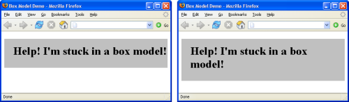
Figure 8.12. Demonstrating the effect of padding-right
Figure 8.12 demonstrates this principle. The first screenshot shows how the page from Figure 8.11 looks if you narrow the browser window so that there would be room for the word “in” on the first line if padding-right was not set as it is. The second screenshot reinforces this idea by showing the page resized so that one word only fits on each line. Notice that, in several cases, the right padding size looks large enough to accommodate the word on the next line. In fact, merely removing the padding-right declaration from the style sheet produces the result shown in Figure 8.12.
Because it’s often necessary to adjust padding around objects in HTML, the CSS standards define a shorthand property that’s simply called padding. You can give this property up to four values; Table 8.1 identifies how the properties will be assigned in each case.
Table 8.1. Effects of multiple values on padding shorthand property
Remembering the Order
To remember the order in which these values are specified, simply recall that they’re identified in clockwise order from the top, or remember the mnemonic trouble (top, right, bottom, and left).
For example, the style rule above could be rewritten using the padding shorthand property as follows:
Example 8.13. boxmodel.html (excerpt)


h1 {

  background-color: #c0c0c0;

  color: black;

  padding: 15px 20px 30px 25px;

}
To create equal top and bottom padding, and equal left and right padding, you could use:
Example 8.14. boxmodel.html (excerpt)


h1 {

  background-color: #c0c0c0;

  color: black;

  padding: 15px 25px;

}
Finally, to create equal padding on all four sides of the h1 element, you could use this markup:
Example 8.15. boxmodel.html (excerpt)


h1 {

  background-color: #c0c0c0;

  color: black;

   padding: 25px;

}
What would happen if you used either ems or percentages for the padding values? The two units have slightly different effects: the em unit scales the padding according to the size of the font of the content, while the percentage unit scales the padding according to the width or height of the block that contains the element. To demonstrate these effects, let’s work with a new HTML page that displays two headings against colored backgrounds on a page of a contrasting color.
Here’s the HTML for that demonstration page:
Example 8.16. boxmodel2.html


<!DOCTYPE html PUBLIC "-//W3C//DTD XHTML 1.0 Strict//EN"

    "https://www.w3.org/TR/xhtml1/DTD/xhtml1-strict.dtd">

<html xmlns="https://www.w3.org/1999/xhtml">

  <head>

    <title>Box Model Demo</title>

    <meta http-equiv="Content-Type"

        content="text/html; charset=iso-8859-1" />

    <style type="text/css">

      body {

        background-color: #808080;

        color: black;

      }

      h1, h4 {

        background-color: #c0c0c0;

        color: black;

      }

    </style>

  </head>

  <body>

    <h1>Help! I'm stuck in a box model!</h1>

    <h4>But it's not too crowded if you're just a little old

        heading like me! In fact, it's kind of cozy in here.</h4>

  </body>

</html>
Notice that I’ve given the page a dark grey background, and I’ve added an h4 element, which I’ve styled in the same CSS rule as the h1 element.
This HTML page displays as shown in Figure 8.13.
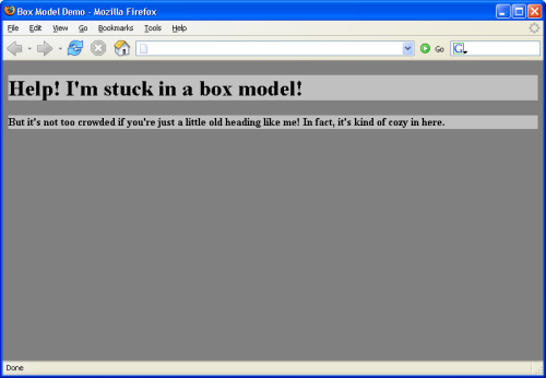
Figure 8.13. Proportional padding page starting point
Now, let’s change the style sheet for this page so that it uses the padding property to create a single-em padding space around the objects. The following code fragment will do the trick:
Example 8.17. boxmodel2.html (excerpt)


body {

  background-color: #808080;

  color: black;

}

h1, h4 {

  background-color: #c0c0c0;

  color: black;

  padding: 1em;

}
As you can see in Figure 8.14, the amount of padding that appears around the two heading elements is proportional to the size of the font used in the elements themselves.
em: a Height Measurement
Remember that one em is equal to the height of the font in use. Consequently, much more space is placed around the h1 element than around the h4 element.
Let’s see what happens if we use a percentage, rather than an em, for the proportional padding value. Change the HTML so that the style sheet looks like this:
Example 8.18. boxmodel2.html (excerpt)


body {

  background-color: #808080;

  color: black;

}

h1, h4 {

  background-color: #c0c0c0;

  color: black;

  padding: 10%;

}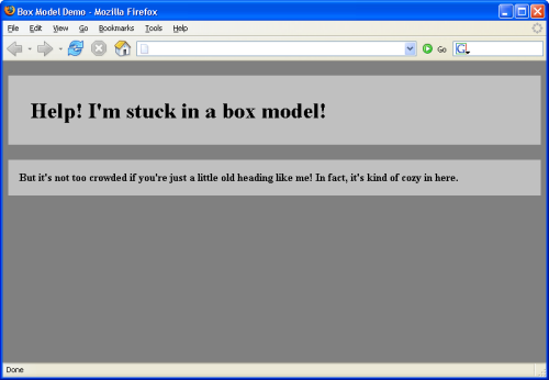
Figure 8.14. Using ems for proportional padding
The result of this change can be seen in Figure 8.15. Wow! There’s a huge amount of space around those elements. The browser has applied 10% of the width of the page as padding on all four sides.
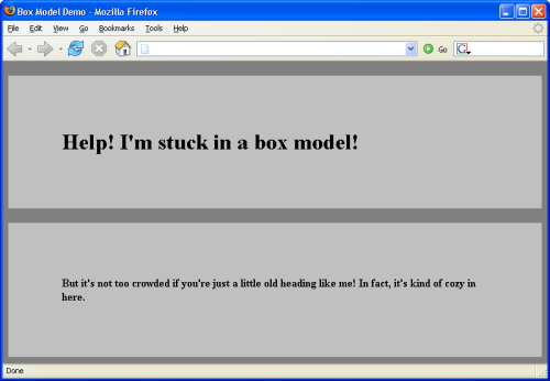
Figure 8.15. Using percentage for proportional spacing
I’ve been using a background color behind the text of these elements to make it easy to see the effect of the different padding settings, but the background colors aren’t required. Figure 8.16 uses the same HTML code as Figure 8.15; the only difference is that I’ve removed the background colors from the body, h1, and h4 elements. As you can see, these elements maintain their relative spacing.
Figure 8.16. Demonstrating padding without colored backgrounds
Margin Properties
The difference between margins and padding is that margins exist outside the boundaries of the object, while padding exists inside those boundaries. Figure 8.17 illustrates this difference according to the style sheet rules that are set in the code fragment below. Margins are set in the same way as padding; the only difference is the substitution of the word “margin” for the word “padding.”
body {

  background-color: #808080;

  color: black;

}

h1 {

  background-color: #c0c0c0;

  color: black;

}

h2 {

  background-color: #c0c0c0;

  color: black;

  margin-left: 5%;

}

p {

  background-color: #c0c0c0;

  color: black;

  margin-left: 20%;

}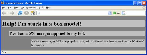
Figure 8.17. margin-left settings pushing the content and background right
Notice that the second-level heading and the paragraph, both of which have margin-left properties, are indented from the left edge of the browser. But, unlike the example in which we set the padding-left property, the text and its background color block are indented in this case. This is because the padding, the color block, and the text are inside the content box, while the margin is outside that box.
Next, let’s apply padding-left and margin-left settings to the code fragment:
body {

  background-color: #808080;

  color: black;

}

h1 {

  background-color: #c0c0c0;

  color: black;

}

h2 {

  background-color: #c0c0c0;

  color: black;

  margin-left: 5%;

  padding-left: 1em;

}

p {

  background: #c0c0c0;

  color: black;

  margin-left: 20%;

  padding-left: 10%;

}
As you can see in Figure 8.18, the above markup has caused the margin to push the HTML elements and their surrounding background color blocks to the right, while the padding has moved the text to the right within the colored background blocks.
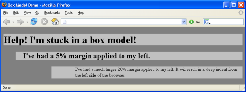
Figure 8.18. Combining margin-left with padding-left
If you load the above HTML (from the file included in the code archive for this book) and resize it, you’ll notice that the indentation of the paragraph and the heading changes as the width of the window changes. That’s because we used relative values of 20% for the margin and 10% for the padding. Both of these values are calculated relative to the width of the containing block, which in this case is the browser window. The bigger the browser window, the bigger the margin and padding on the paragraph. The padding on the heading doesn’t change, as it’s specified in ems.
Margins, Padding, and Lists
By default, all visual browsers will apply a 50-pixel margin to the left edge of a list. This allows room for the list item markers (bullets in the case of a bulleted list; numbers in the case of an ordered list). Unfortunately, the CSS Specification doesn’t say explicitly whether this space should be implemented as left margin or left padding in the browser’s default style rules. However, the description of the marker-offset property does imply that margin is the way to go.
Whatever the intent of the specification, Firefox and Safari apply a default padding to the left side of lists, while most other browsers (including Internet Explorer and Opera) use a margin. You can test this easily by applying a background-color to an ol or ul element. On most browsers, the background will not cover the list item markers; on Firefox and Safari, they will.
For this reason, whenever you apply your own left margin or padding value to a list, you must be sure to specify both. If you applied only a margin, for example, the default list indentation would display in Firefox, but be overridden on all other browsers. If you applied a padding value only, the default 50-pixel margin would display on Internet Explorer. Only by specifying both margin and padding (usually by setting padding: 0 and using margin to do the job) can you ensure consistent rendering across current browsers.
You can set vertical margins with the margin-top and margin-bottom properties. Here’s another HTML page that demonstrates vertical margins:
Example 8.19. boxmodel3.html


<!DOCTYPE html PUBLIC "-//W3C//DTD XHTML 1.0 Strict//EN"

    "https://www.w3.org/TR/xhtml1/DTD/xhtml1-strict.dtd">

<html xmlns="https://www.w3.org/1999/xhtml">

  <head>

    <title>Box Model Demo</title>

    <meta http-equiv="Content-Type"

        content="text/html; charset=iso-8859-1" />

    <style type="text/css">

      body {

        background-color: #808080;

        color: black;

      }

      h1 {

        background-color: #c0c0c0;

        color: black;

        margin-bottom: 5cm;

      }

      h2 {

        background-color: #c0c0c0;

        color: black;

        margin-left: 5%;

        margin-top: 5cm;

        margin-bottom: 5cm;

        padding-left: 1em;

      }

      p {

        background: #c0c0c0;

        color: black;

        margin-left: 20%;

        padding-left: 10%;

        margin-top: 5cm;

        margin-bottom: 5cm;

      }

    </style>

  </head>

  <body>

    <h1>No top margin but a 5cm bottom margin</h1>

    <h2>Top and bottom margins are set to 5cm</h2>

    <p>A paragraph with top and bottom margins set to 5cm</p>

  </body>

</html>
This page renders as shown in Figure 8.19.
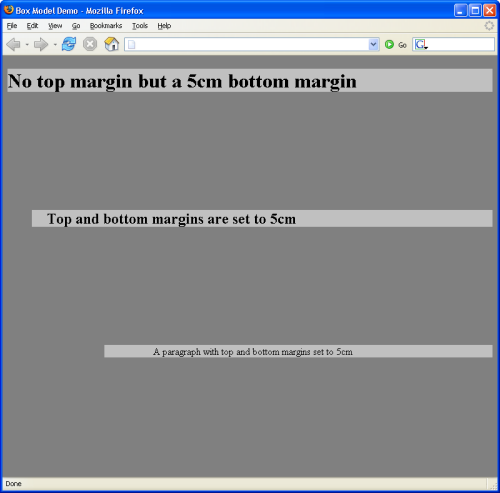
Figure 8.19. Demonstrating vertical margins
Unlike horizontal margins, vertical margins are not cumulative. If you have two elements stacked one atop the other, like the h1 and h2 elements shown in Figure 8.19, the vertical spacing between them will be the greater of the margin-bottom setting of the top element, and the margin-top setting of the bottom element. In this case, they are both 5cm, so the distance between the two elements is 5cm (not 10cm, as you might have supposed). If I had defined the margin-bottom of the h1 as 10cm, then the vertical distance separating the two elements would have been 10cm. The containing block in this case is the body, which is, for all practical purposes, the same as the browser window’s client area.
It is possible to use negative values for margin property settings. This comes in handy when you’ve set a margin-left property for the body of an HTML page, but you want to move an element closer to the left margin of the page. The following HTML results in the display shown in Figure 8.20:
Example 8.20. boxmodel4.html


<!DOCTYPE html PUBLIC "-//W3C//DTD XHTML 1.0 Strict//EN"

    "https://www.w3.org/TR/xhtml1/DTD/xhtml1-strict.dtd">

<html xmlns="https://www.w3.org/1999/xhtml">

  <head>

    <title>Box Model Demo</title>

    <meta http-equiv="Content-Type"

        content="text/html; charset=iso-8859-1" />

    <style type="text/css">

      body {

        background-color: #808080;

        color: black;

        margin-left: 5cm;

      }

      h1 {

        background-color: #c0c0c0;

        color: black;

        margin-left: -3cm;

      }

      h2 {

        background-color: #c0c0c0;

        color: black;

      }

    </style>

  </head>

  <body>

    <h1>The body's margin-left is 5cm, but mine is -3cm. </h1>

    <h2>I have no margin-left setting, so I use the body's 5cm

        setting.</h2>

  </body>

</html>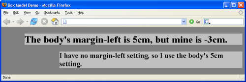
Figure 8.20. Negative margin setting in practice
As with the padding property, the margin shorthand property lets you set all four margins with a single declaration, and interprets multiple values using the rules shown in Table 8.1.
Border Properties
Border properties are more complex than padding and margin properties because they affect not only the spacing between objects, but the appearance of that intervening space. A border can be, and usually is, visible. In most ways, managing border properties is similar to the process for managing margins and padding, but there are some key differences.
Borders have three types of properties: style, width, and color. By default, a border’s style is set to none, its width to medium (note that Netscape 4 sets a default border width of 0, so you can’t rely on the default value if you wish to target that browser), and its color to the text color of the HTML element to which it is applied.
The border-style property can take any one of a range of constant values. The available values are solid, dashed, dotted,
groove, ridge, inset, outset, hidden, and none.
The hidden value has the same effect as none, except when applied to table layouts. Refer to the border-style property in Appendix C, CSS Property Reference for further details.
W3C specifications largely leave the issue of the precise appearance of these borders up to the browsers, so don’t be surprised if the results of using these characteristics vary a bit from browser to browser, and platform to platform. But, as is the case with default behaviors for other border settings, generally speaking, the browsers treat this issue predictably and satisfactorily within reason.
The width of a border around an object can be set either with four individual declarations, or with the border-width shorthand syntax. The four properties are border-top-width, border-right-width, border-bottom-width, and border-left-width. Each of these properties can be set with an absolute or relative length unit (such as pixels, ems, percentages, or inches), or with one of three descriptive settings: thin, medium, or thick.
If you use the descriptive settings of thin, medium, and thick, the results are browser-dependent. However, they are fairly predictable and consistent across browsers and operating systems, within a pixel or so for each of the three descriptive settings.
Specific Border Measurements
If you wish to use specific measurements for border widths, you should use pixels. This is the most meaningful unit of measurement for screen layouts, which is where border-width is an important property.
You can control the colors associated with all four borders using the border-top-color, border-right-color, border-bottom-color, and border-left-color properties, or you can just use the border-color shorthand property.
As we discovered in Chapter 5, Splashing Around a Bit of Color, you can supply a color argument in any of the standard ways: using a hexadecimal RGB code (as in #ff9900), using a three-digit hexadecimal RGB shortcut (as in #f90), via the rgb function (as in rgb(102,153,0)), or using a standard color name (as in red).
The shorthand properties border-style, border-width, and border-color all accept multiple values.
There is one additional shorthand property that’s probably the most widely used. The border property allows you to specify the style, width, and color of all four borders of an object in a compact form. Since a border that’s uniform on all sides is most often your desire, this is an efficient way to set border property values.
The following style rule will produce a uniform, three-pixel, solid, red border around any element with a class="warning":
.warning {

  border: 3px solid red;

}
Constructing the Layout
Now that we have some background knowledge of the ways in which elements behave when they’re positioned using CSS, we can put our learning into practice with our first layout.
Create a new style sheet named styles.css and link it to the Footbag Freaks document we created earlier by adding the following markup to the head of the document:
Example 8.21. index.html (excerpt)


<head>

  <title>Footbag Freaks</title>

  <meta http-equiv="Content-Type"

      content="text/html; charset=iso-8859-1" />

  <link rel="stylesheet" type="text/css" href="styles.css" />

</head>
The first element to which we’ll add CSS is the body element. The design has a background image that starts with a pattern but gradually blends into a deep blue. To create this effect on our page, we’ll apply the image as a tiled background, and give the page a blue background color. This way, when the background image finishes, it seamlessly merges into the blue page background.
Download Footbag Freaks
The Footbag Freaks web site, including all images, is available for download as part of the code archive for this book.
Let’s also set a font family and size, and set the margin and padding for the page (the space between the edge of the viewport and your content) to 0, using the markup below.
Example 8.22. styles.css


body {

  margin: 0;

  padding: 0;

  background-color: #050845;

  color: white;

  background-image: url(img/bg.jpg);

  background-repeat: repeat-x;

  font: small Arial, Helvetica, Verdana, sans-serif;

}
Setting Freaks font-size
I’ve set the font-size on the body using the keyword small. As we create the rest of the style sheet, I’ll use percentage font sizes to make the size of each element a percentage of small.
Now, your background image should tile across the width of the page, as shown in Figure 8.21.
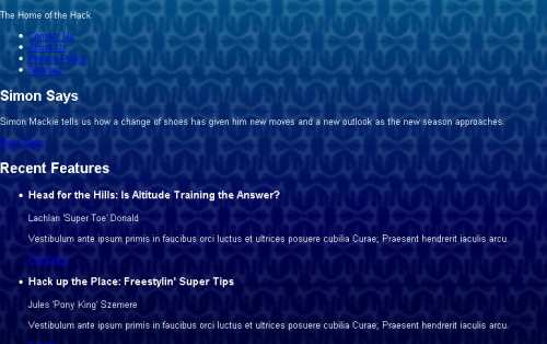
Figure 8.21. The background image tiling across the width of the page
In our layout image, the content of the page is contained in an off-white box. To create this box, we need to add another div in which we can wrap the content. So, immediately after the opening <body> tag in your document, add the markup shown in bold below:
Example 8.23. index.html (excerpt)


<body>

  <div id="wrapper">

    <div id="header">

      <p>The Home of the Hack</p>
Don’t forget to close this div immediately before the document’s closing </body> tag, like so:
Example 8.24. index.html (excerpt)


      <p><a href="">more</a></p>

    </div> <!-- main -->

  </div> <!-- wrapper -->

</body>
Now, let’s add to the style sheet the rules that will give the box an off-white background. We’ll also insert rules that add a margin to the wrapper area, creating a space between the wrapper and the body element to let the background image show through:
Example 8.25. styles.css (excerpt)


#wrapper {

  background-color: #fdf8f2;

  color: black;

  margin: 30px 40px 30px 40px;

}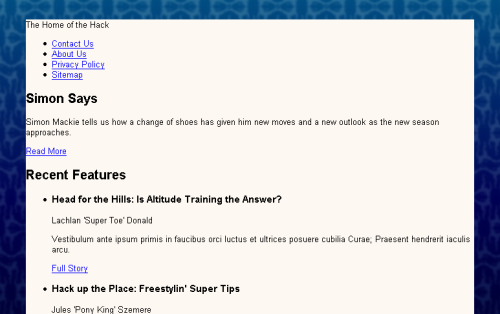
Figure 8.22. The effect of the styled wrapper div
Figure 8.22 shows the results of our work. The margin has created a space that lets the background show through, but the content inside the wrapper bumps right up against the edge of the off-white area. We can create some extra space here by adding padding to the #wrapper rule, as shown in the markup below. The resulting display is shown in Figure 8.23.
Example 8.26. styles.css (excerpt)


#wrapper {

  background-color: #fdf8f2;

  color: black;

  margin: 30px 40px 30px 40px;

  padding: 10px;

}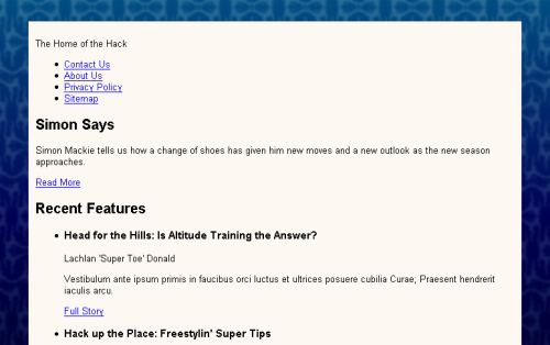
Figure 8.23. Extra padding creating space between the box’s edge and its content
The Header Area
Let’s turn our attention to the header area of our layout, which contains the site logo and main navigation. You’ll remember that when we created our HTML document, we didn’t add any images: we were going to decide how best to include our images as we developed the layout. But now, let’s add the logo image using the img element. We’ll also include the site name as alt text for the image, so that users who are browsing the site with images turned off, and those with screen readers, can read the name of the site.
In your document, insert the image directly below the opening header div, like this:
Example 8.27. index.html (excerpt)


<body>

  <div id="wrapper">

    <div id="header">

      <img src="img/logo.gif" alt="Footbag Freaks" height="77"

          width="203" />

      <p>The home of the hack</p>

      <ul>

        <li><a href="">Contact Us</a></li>

        <li><a href="">About Us</a></li>

        <li><a href="">Privacy Policy</a></li>

        <li><a href="">Sitemap</a></li>

      </ul>

    </div> <!-- header -->
If you view the page in a browser, you should see the image in the top, left corner of the off-white box.
The graphic for our page layout shows a thin, light-blue border that appears above and below the site’s tagline and navigation. How will we create this effect? Let’s contain the tagline and navigation in another div to which we can apply a top and bottom border. Add the div like so:
Example 8.28. index.html (excerpt)


<body>

  <div id="wrapper">

    <div id="header">

      <img src="img/logo.gif" alt="Footbag Freaks" height="77"

          width="203" />

      <div id="header-bottom">

        <p>The home of the hack</p>

        <ul>

          <li><a href="">Contact Us</a></li>

          <li><a href="">About Us</a></li>

          <li><a href="">Privacy Policy</a></li>

          <li><a href="">Sitemap</a></li>

        </ul>

      </div> <!-- header-bottom -->

    </div> <!-- header -->
We can now address #header-bottom as we add the top and bottom borders:
Example 8.29. styles.css (excerpt)


#header-bottom {

  border-top: 1px solid #b9d2e3;

  border-bottom: 1px solid #b9d2e3;

}
To style the navigation list and tagline, we’ll use some simple text formatting properties that should now be fairly familiar!
Example 8.30. styles.css (excerpt)


#header-bottom ul {

  margin: 0;

  padding: 0;

}

#header-bottom li {

  display: inline;

}

#header-bottom a:link, #header-bottom a:visited {

  text-decoration: none;

  background-color: #fdf8f2;

  color: #050845;

}

#tagline {

  font-weight: bold;

  background-color: #fdf8f2;

  color: #050845;

  font-style: italic;

}
We also need to add an id attribute to the paragraph that contains our tagline:
Example 8.31. index.html (excerpt)


<p id="tagline">The home of the hack</p>
Figure 8.24. Styling navigation list items with display: inline
We set the margin and padding on the list within this area to 0, then set the li element’s display property to inline, which will cause the list items to display on the same line, rather than having each item display on a new line. Figure 8.24 shows this effect in action. We also styled the navigation links – again using the dark blue and removing the underlines from them – and the tagline, which we made bold, italic, and the same blue as our navigation items.
The problem with the display shown in Figure 8.24 is that it’s difficult to distinguish the links in the navigation list from one another. The recommended solution to this problem is to add a visible character – such as the pipe character (|) – between each of the links, as I’ve done in the markup below (note that this recommendation was made as part of the Web Content Accessibility Guidelines (WCAG) 1.0. The checkpoint that covers this specific issue can be seen here):
Example 8.32. index.html (excerpt)


<ul>

  <li><a href="">Contact Us</a> | </li>

  <li><a href="">About Us</a> | </li>

  <li><a href="">Privacy Policy</a> | </li>

  <li><a href="">Sitemap</a></li>

</ul>
We can also set the color of the list items to dark blue (#050845), so that the pipe character that sits outside of the anchor element will be blue, too. Our refined header design is shown in Figure 8.25.
Example 8.33. styles.css (excerpt)


#header-bottom li {

  display: inline;

  background-color: #fdf8f2;

  color: #050845;

}
Figure 8.25. After styling the text elements in the header area
The header is really starting to take shape now! Our next step is to move the tagline and navigation up onto the same line. To do this, we’ll have to use a property that, while we haven’t discussed it in detail yet, will become more important to us as we progress through these layouts. That property is float.
The float Property
floatis one of the most interesting and often-used CSS properties. It takes a value ofleft,right, ornone(thoughnone, the default, is rarely used).floatforces the element to which it's applied to display outside its natural position in the containing box; afloatvalue ofleftorrightpushes the element to the left or the right of its natural position, respectively. This property can be used within any block element.
The float property is designed to replace the align attribute that’s associated with the HTML img element, and has, for all practical purposes, precisely the same effect. The align attribute is deprecated in favor of the float property in recent releases of HTML Recommendations from the W3C. The following HTML fragment uses the float property to produce the result shown in Figure 8.26:
<p><img src="logo.gif" alt="Footbag Freaks Logo"

    width="203" height="77"

    style="float: left; padding-right: 1em;" />The Footbag Freaks

    logo appears to the left of this paragraph. Depending on

    whether or not I use the CSS <code>float</code> property, I

    may see more than one line of text beside the logo. The CSS

    <code>float</code> property replaces the deprecated

    <code>align</code> attribute of the HTML <code>img</code>

    element and has an identical effect.</p>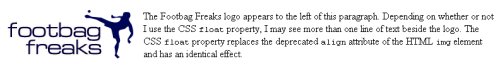
Figure 8.26. Achieving image-text alignment using the CSS float property
The float property has one major advantage over the align attribute: float can be applied to elements other than images, whereas application of the old align attribute was limited to img, applet, and object elements.
No Dimensions? Declare a width
When using the float property on elements that don’t have well-defined dimensions, you must include a width declaration in your CSS. An img is an example of an element with well-defined dimensions, whereas a paragraph, a heading, or a div doesn’t.
Using float in our Header
We’ll be exploring the float property in more detail in the next chapter, when we create a layout that relies on float for the positioning of the page’s main sections. However, at this point we can use our knowledge of float to align the tagline and navigation correctly. The element that we’re going to float is the tagline paragraph, so add the rules marked in bold below to your tagline rule:
Example 8.34. styles.css (excerpt)


#tagline {

  font-weight: bold;

  background-color: #fdf8f2;

  color: #050845;

  font-style: italic;

  margin: 0;

  padding: 0 0 0 20px;

  width: 300px;

  float: left;

}
We set float to 0 so that the paragraph’s default margin is removed. We then add 20 pixels of left padding to move the tagline in from the left-hand side, and give it a width of 300 pixels to provide a bit of space to its right, as is indicated in the page’s original layout graphic. We then set the value of float to left, so it sits to the left of the rest of the content, which in this case, is our navigation list.
After making this change to the rules for the tagline paragraph, save your style sheet and view your page in a browser. You should see the navigation display alongside the tagline. These elements behave in exactly the same way as the paragraph that wraps around the image in the example we discussed above. All we need to do now is to align the list of navigation items to the right, and alter the padding on the list to move it in slightly from the right-hand edge. Here’s the markup you’ll need; the resulting display is depicted in Figure 8.27.
Example 8.35. styles.css (excerpt)


#header-bottom ul {

  margin: 0;

  padding: 0 30px 0 0;

  text-align: right;

}
Figure 8.27. The display after floating the tagline and aligning the navigation
The final task that will complete the heading is to add the little footbag image that displays to the right of the navigation in our layout image. First, add the actual image to your document, beneath the navigation list. In the markup below, I gave this image an empty alt attribute, so that nothing about this image would be read out by a screen reader – this image is included for display purposes only. I’ve also given the image an id of ball.
Example 8.36. index.html (excerpt)


<div id="header">

  <img src="img/logo.gif" alt="Footbag Freaks" height="77"

      width="203" />

  <div id="header-bottom">

    <p id="tagline">The home of the hack</p>

    <ul>

      <li><a href="">Contact Us</a> | </li>

      <li><a href="">About Us</a> | </li>

      <li><a href="">Privacy Policy</a> | </li>

      <li><a href="">Sitemap</a></li>

    </ul>

    <img src="img/header-ball.gif" height="24" width="20" alt=""

        id="ball" />

  </div> <!-- header-bottom -->

</div> <!-- header -->
Now, let’s use our first bit of absolute positioning in the CSS to get the image to line up properly. We know the location at which the image should be positioned relative to the top and right-hand sides of the document, as we know the height of the logo and width of the margin on the wrapper div. The following CSS will place the ball in the correct position at the end of the navigation:
#ball {

  position: absolute;

  top: 110px;

  right: 55px;

}
The header section is now complete! It’s displayed in Figure 8.28.
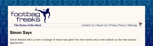
Figure 8.28. The completed header section of the layout
The Content Area
Let’s move on to create the look and feel of the main content area of the page. The first thing we’ll do is contain the sidebar and content divs within another div that has an id of main. This will help us to line up the sidebar and content divs beneath the header. Add the opening <div id="main"> just after the header’s closing </div>:
Example 8.37. index.html (excerpt)


    <img src="img/header-ball.gif" height="24" width="20" alt=""

        id="ball" />

  </div> <!-- header-bottom -->

</div> <!-- header -->

<div id="main">

  <div id="content">

    <h2>Simon Says</h2>
Close this div immediately after the closing </div> tag of the sidebar div. In the style sheet, give #main a margin-top of ten pixels to separate the content and header areas, as shown in the snippet below. We’ll return to #main later, as we create our layout.
Example 8.38. styles.css (excerpt)


#main {

  margin-top: 10px;

}
Now, let’s create a rule for #content. Add the following set of declarations to your style sheet:
Example 8.39. styles.css (excerpt)


#content {

  margin: 0 240px 0 0;

  border: 1px solid #b9d2e3;

  background-color: white;

  color: black;

}
We set the top margin of #content to 0. Then, we add a 240-pixel right-hand margin, leaving space for us to position our sidebar later.
We also give the box a solid, single-pixel border in the same blue we used for the heading borders, and give it a background color of white.
The Main Feature
At the very top of the page is a “boxout”: an area that’s visually contained within a box that highlights it. This particular boxout highlights the main feature article. Let’s look at that now.
Create a container for the main feature area by adding a div with an id of mainfeature; wrap it around the heading, paragraph, and link of the main feature:
Example 8.40. index.html (excerpt)


<div id="content">

  <div id="mainfeature">

    <h2>Simon Says</h2>

    <p>Simon Mackie tells us how a change of shoes has given him

        new moves and a new outlook as the new season approaches.

        </p>

    <p><a href="">Read More</a></p>

  </div> <!-- mainfeature -->

  <h2>Recent Features</h2>
Now you can style the main feature area in your style sheet:
Example 8.41. styles.css (excerpt)


#mainfeature {

  background-image: url(img/mainimg.jpg);

  background-repeat: no-repeat;

  background-color: #112236;

  color: white;

  padding: 2em 2em 1em 200px;

}
Here, we add the background image, maining.jpg, and set it to no-repeat. But if a user has the browser open to dimensions that are wider than the image, we don’t want the exposed areas of the page to display white. To prevent this from happening, we add a background color of #112236; this is the same color as the far right-hand side of the image, so the image should appear to fade into the background color seamlessly. We then set the text color to white and use padding to position the text two ems from the top of the box, two ems from the right, one em from the bottom, and 200 pixels from the left-hand side, so that it’s clear of the image of the footbag player.
Next, we style the heading and the paragraphs within the boxout:
Example 8.42. styles.css (excerpt)


#mainfeature h2 {

  margin: 0;

  font-weight: normal;

  font-size: 140%;

}

#mainfeature p {

  font-size: 110%;

}
Finally, we need to style the “Read More” link that leads readers to the full article. Let’s start by adding a class="more" attribute to the paragraph element so that we can target it with our style rules:
Example 8.43. index.html (excerpt)


<div id="mainfeature">

  <h2>Simon Says</h2>

  <p>Simon Mackie tells us how a change of shoes has given him new

      moves and a new outlook as the new season approaches.</p>

  <p class="more"><a href="">Read More</a></p>

</div>
First, we remove the top margin from the paragraph that contains the link, to decrease the space between it and the paragraph. Then, we set text-align to right:
Example 8.44. styles.css (excerpt)


#mainfeature p.more {

  margin-top: 0;

  text-align: right;

}

#mainfeature p.more a:link, #mainfeature p.more a:visited {

  color: white;

  background-image: url(img/more-bullet.gif);

  background-repeat: no-repeat;

  background-position: center left;

  padding-left: 14px;

}
We then style the link and visited pseudo-classes, changing their color to white and adding the more-bullet.gif background image. We only want to see the bullet once, so we set repeat to no-repeat, then position the background center and left. This positions the image in the center of the link’s text. Finally, in order to stop the text from displaying over the top of the background image, we set padding-left to 14 pixels. The impact of these changes is shown in Figure 8.29.
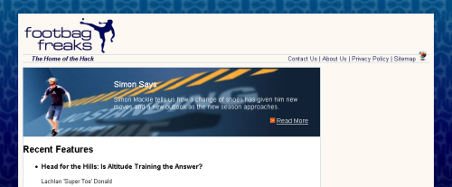
Figure 8.29. After styling the main feature section
The Features List
Our layout is really starting to take shape now! Let’s spend some time styling the main content on this page: the list of feature articles.
At the moment, the text inside the content area butts up against the border of the box. I want to create some space between that border and the content. The contents of the home page content div are enclosed in an unordered list, so one option we have is to add a margin to that list and to the h2 above it. However, another page might have a different kind of main content, so in order that all of the pages can be dealt with in the same way, let’s add another div, which wraps around the heading and features list, and give it a class of inner:
Example 8.45. index.html (excerpt)


<div id="content">

  <div id="mainfeature">

    <h2>Simon Says</h2>

    <p>Simon Mackie tells us how a change of shoes has given him

        new moves and a new outlook as the new season approaches.

        </p>

    <p class="more"><a href="">Read More</a></p>

  </div> <!-- mainfeature -->

  <div class="inner">

    <h2>Recent Features</h2>

    <ul>

      <li>

        <h3>Head for the Hills: Is Altitude Training the

            Answer?</h3>

        <p>Lachlan 'Super Toe' Donald</p>

       <p>Vestibulum ante ipsum primis in faucibus orci luctus et

            ultrices posuere cubilia Curae; Praesent hendrerit

            iaculis arcu.</p>

        <p><a href="">Full Story</a></p>

      </li>

      <li>

        <h3>Hack up the Place: Freestylin' Super Tips</h3>

        <p>Jules 'Pony King' Szemere</p>

       <p>Vestibulum ante ipsum primis in faucibus orci luctus et

            ultrices posuere cubilia Curae; Praesent hendrerit

            iaculis arcu.</p>

        <p><a href="">Full Story</a></p>

      </li>

      <li>

        <h3>The Complete Black Hat Hacker's Survival Guide</h3>

        <p>Mark 'Steel Tip' Harbottle</p>

       <p>Vestibulum ante ipsum primis in faucibus orci luctus et

            ultrices posuere cubilia Curae; Praesent hendrerit

            iaculis arcu.</p>

        <p><a href="">Full Story</a></p>

      </li>

      <li>

        <h3>Five Tricks You Didn't Even Know You Knew</h3>

        <p>Simon 'Mack Daddy' Mackie</p>

       <p>Vestibulum ante ipsum primis in faucibus orci luctus et

            ultrices posuere cubilia Curae; Praesent hendrerit

            iaculis arcu.</p>

        <p><a href="">Full Story</a></p>

      </li>

    </ul>

  </div>

</div> <!-- content -->
To create some space between the features list and the border of the containing box, let’s add a margin to #content .inner in the style sheet:
Example 8.46. styles.css (excerpt)


#content .inner {

  margin: 10px 20px 10px 40px;

}
If you view your layout in the browser, you should see the space that this margin creates. We can now address the content of this section.
First, let’s style the heading. In our layout image, the heading has a blue underline that stretches across the entire width of the content – an effect we can create using a bottom border. Let’s also add a small amount of padding to the bottom of the h2, to insert some space between the text and this border:
Example 8.47. styles.css (excerpt)


#content .inner h2 {

  color: #245185;

  padding-bottom: 0.2em;

  border-bottom: 1px solid #b9d2e3;

  font-size: 110%;

}
Next, let’s add a rule to remove the margin and list bullets from the list of feature items. While we could simply create this rule for #content .inner ul, as there’s only one list in this page’s layout, that approach might cause problems on other pages whose content includes lists that are not like this special features list. So let’s add a class="features" attribute to the ul element first, so we can style this particular list – and others like it – without affecting any normal, non-feature lists within page content:
Example 8.48. index.html (excerpt)


<div class="inner">

  <h2>Recent Features</h2>

  <ul class="features">

    <li>


Example 8.49. styles.css (excerpt)


#content .inner ul.features {

  margin: 0;

  padding: 0;

  list-style: none;

}
Each feature has a level three heading; we’ll style these by increasing the font size:
Example 8.50. styles.css (excerpt)


#content .inner h3 {

  font-size: 130%;

}
Let’s also make each of these headings act as a link to the appropriate article on the Footbag Freaks site. We can style the link and visited pseudo-classes, as well:
Example 8.51. index.html (excerpt)


<li>

  <h3><a href="">Head for the Hills: Is Altitude Training the

      Answer?</a></h3>

  <p>Lachlan 'Super Toe' Donald</p>

  <p>Vestibulum ante ipsum primis in faucibus orci luctus et

      ultrices posuere cubilia Curae; Praesent hendrerit iaculis

      arcu.</p>

  <p><a href="">Full Story</a></p>

</li>

<li>

  <h3><a href="">Hack up the Place: Freestylin' Super Tips</a></h3>

  <p>Jules 'Pony King' Szemere</p>

  <p>Vestibulum ante ipsum primis in faucibus orci luctus et

      ultrices posuere cubilia Curae; Praesent hendrerit iaculis

      arcu.</p>

  <p><a href="">Full Story</a></p>

</li>


Example 8.52. styles.css (excerpt)


#content .inner h3 a:link, #content .inner h3 a:visited {

  color: #245185;

}
Finally, let’s style the page’s paragraph text by making it a dark gray and decreasing the font size to 90%:
Example 8.53. styles.css (excerpt)


#content .inner p {

  color: #666666;

  font-size: 90%;

}
The Author Images
We want to display an image of the author alongside each feature article listing. Add the image to each feature item, after the heading, like so:
Example 8.54. styles.css (excerpt)


<li>

  <h3><a href="">Head for the Hills: Is Altitude Training the

      Answer?</a></h3>

  <img src="img/lachlan.jpg" alt="Lachlan Donald" height="48"

      width="35" />

  <p>Lachlan 'Super Toe' Donald</p>

  <p>Vestibulum ante ipsum primis in faucibus orci luctus et

      ultrices posuere cubilia Curae; Praesent hendrerit iaculis

      arcu.</p>

  <p class="more"><a href="">Full Story</a></p>

</li>
This markup produces the display shown in Figure 8.30.
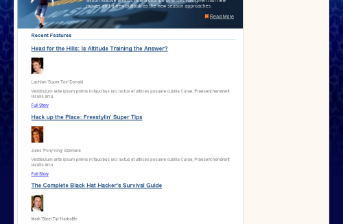
Figure 8.30. Displaying author images in the document
Let’s use the float: left declaration to move these author shots to the left of the paragraph text. Note that we don’t need to include the image’s width here, as each img already has a width defined.
Example 8.55. styles.css (excerpt)


#content .inner .features li img {

  float: left;

  margin: 0 5px 5px 0;

}
Here, we’ve used a selector that will address only those images that are within an li element with the class="features" attribute. This way, we avoid affecting any other images that might be added to your content.
We’ve set the image to float left, and added a margin so that the text doesn’t sit right next to the image – it has a little breathing room, as Figure 8.31 shows.
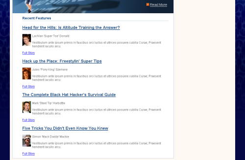
Figure 8.31. Floating the author image
In our layout graphic, author names appear in bold text, so let’s give the paragraph surrounding the author name a class attribute with the value author, and use a CSS rule to style it bold. We’re not doing this with any <strong> or <b> tags because we’re styling the author names purely for aesthetic reasons – not for any structural purpose. By keeping the author name styles out of the page markup, we’re sticking to our goal of separating content from presentation. And, since we’re using CSS, if we want to change the way the author name displays in future, we can simply edit the rules for the appropriate class, instead of finding every page on which an author’s name is displayed and changing it there. Here’s the change we need to make to the page markup, followed by the CSS rule that will make all suitably marked-up author names bold:
Example 8.56. index.html (excerpt)


<img src="img/lachlan.jpg" alt="Lachlan Donald" height="48"

    width="35" />

<p class="author">Lachlan 'Super Toe' Donald</p>

<p>Vestibulum ante ipsum primis in faucibus orci luctus et ultrices

    posuere cubilia Curae; Praesent hendrerit iaculis arcu.</p>


Example 8.57. styles.css (excerpt)


#content .inner p.author {

  font-weight:  bold;

}
The final page element that we need to style for this section is the “Full Story” links that appear beneath each feature. Add a class of more to each link’s opening <p> tag, then add the following rules to your style sheet:
Example 8.58. styles.css (excerpt)


#content .inner p.more{

  margin-top: 0;

  text-align: right;

}

#content .inner p.more a:link, #content .inner p.more a:visited {

  color: black;

  background-image: url(img/more-bullet.gif);

  background-repeat: no-repeat;

  background-position: center left;

  padding-left: 14px;

  font-size: 90%;

  color: #1e4c82;

}
As I’m sure you’ve noticed, this styling is very similar to that of the “Read More” link within the feature article section at the top of the page.
Your layout should now look a lot like the original layout graphic. Our progress is shown in Figure 8.32. The page is very close to completion: we have only the sidebar left to style!
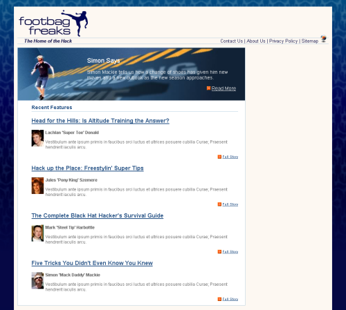
Figure 8.32. Displaying the page after styling the main content area
The Sidebar
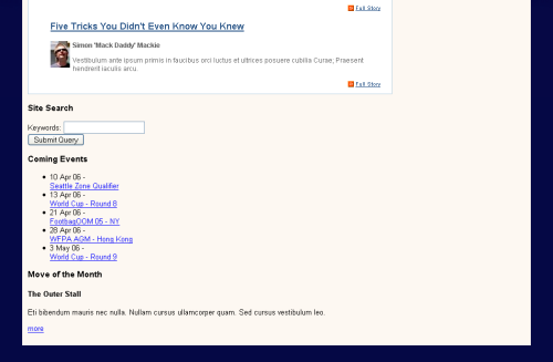
Figure 8.33. The unstyled sidebar
The content of the sidebar is languishing beneath the main content area, as Figure 8.33 illustrates. No rules have been applied to it, so it’s just sitting in its natural location in the document.
Our first job is to move the sidebar from this position to the space we’ve created for it on the right of the content area.
First, let’s see what happens if we position the sidebar using absolute positioning from the top and right. Add the following rules to your style sheet:
Example 8.59. styles.css (excerpt)


#sidebar {

  position: absolute;

  top: 0;

  right: 0;

  width: 220px;

  background-color: #256290;

  color: white;

  margin: 0;

  padding: 0;

}
View your page in the browser. The sidebar is stuck to the top, right corner of the viewport as in Figure 8.34.
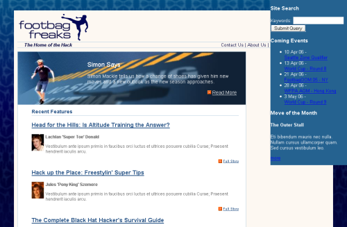
Figure 8.34. Positioning the sidebar top and right
When we discussed absolute and relative positioning earlier, I explained that an element is always positioned relative to its parent element’s position, and that this concept was described as an element’s positioning context. In this case, #sidebar doesn’t have a positioned parent element, so it takes the viewport as its positioning context.
However, we do have an element that can be positioned to provide us with a useful positioning context – the div with id="main".
Find #main in your style sheet and add the following declarations:
Example 8.60. styles.css (excerpt)


#main {

  position: relative;

  top:0;

  left:  0;

  width: 100%;

  margin-top: 10px;

}
The sidebar now takes #main as its parent, so it falls into place within the area defined by the div with that id, as Figure 8.35 illustrates.
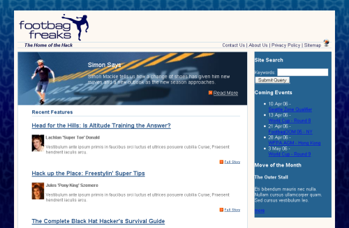
Figure 8.35. Positioning the sidebar to the top and right of a relatively positioned container
With our sidebar now in position, we can start to style its contents. To start, we’ll style the h3 headings that head the different sections of the sidebar:
Example 8.61. styles.css (excerpt)


#sidebar h3 {

  font-size: 110%;

  background-image: url(img/sidebar-header-bg.jpg);

  background-repeat: no-repeat;

  margin: 0;

  padding: 0.2em 0 0.2em 10px;

  font-weight: normal;

}
Here, we’re displaying a background image behind the heading to create the gradient effect we saw in our design comp.
Good Looks in the Background
Using a background image behind a heading is a great way to make your headings more attractive without resorting to using an image for the actual heading text. Using an image to display headings makes your site more difficult to maintain, as you need to manipulate those images every time you want to make even minor changes.
Let’s have a closer look at the sections of content that display below each of the headings in the sidebar. We need to add a div with a class of inner to each of these, in order to create a little space and move the text content away from the border. Add this div to each of the three sections, as shown here:
Example 8.62. index.html (excerpt)


<div id="sidebar">

  <div class="inner">

    <h3>Site Search</h3>

    <form method="post" action="" id="searchform">

      <div>

        <label for="keywords">Keywords</label>:

        <input type="text" name="keywords" id="keywords" />

      </div>

      <div>

        <input type="submit" name="btnSearch" id="btnSearch" />

      </div>

    </form>

  </div>

  <div class="inner">

    <h3>Coming Events</h3>

    <ul>

      <li>10 Apr 06 -<br /><a href="">Seattle Zone

          Qualifier</a></li>

      <li>13 Apr 06 -<br /><a href="">World Cup - Round 8</a></li>

      <li>21 Apr 06 -<br /><a href="">FootbagOOM 05 - NY</a></li>

      <li>28 Apr 06 -<br /><a href="">WFPA AGM - Hong

          Kong</a></li>

      <li>3 May 06 -<br /><a href="">World Cup - Round 9</a></li>

    </ul>

  </div>

  <div class="inner">

    <h3>Move of the Month</h3>

    <h4>The Outer Stall</h4>

    <p>Eti bibendum mauris nec nulla. Nullam cursus ullamcorper

        quam. Sed cursus vestibulum leo.</p>

    <p><a href="">more</a></p>

  </div>

</div> <!-- sidebar -->
Now, let’s add ten pixels of padding to inner:
Example 8.63. styles.css (excerpt)


#sidebar .inner {

  padding: 10px;

}
Figure 8.36. The display after styling the headings and inner class
As you can see in Figure 8.36, the sidebar is starting to take shape. Now, let’s address the list of events.
Example 8.64. styles.css (excerpt)


#sidebar ul {

  list-style-image: url(img/more-bullet.gif);

  margin-left: 0;

  padding-left: 20px;

}
In the markup above, we use the more-bullet.gif image as the list bullet, remove the margin, and add left padding of 20 pixels in order to display the list in line with the headings.
Example 8.65. styles.css (excerpt)


#sidebar p, #sidebar li {

  font-size: 90%;

  line-height: 1.4em;

}
Next up, we decrease the font size of the paragraph and list item text by reducing it to 90%. We also create a little more spacing between the lines with the help of the line-height property.
Example 8.66. styles.css (excerpt)


#sidebar ul a:link, #sidebar ul a:visited {

  color:  white;

}
The links in the sidebar are white and underlined in the mock-up, so we set them to white with the rule above.
Finally, let’s make all the dates in the event list bold. Add a span with class="date" to each of the dates in the list, then style them using the selector #sidebar .date, like this:
Example 8.67. index.html (excerpt)


<ul>

  <li><span class="date">10 Apr 06</span> -<br />

      <a href="">Seattle Zone Qualifier</a></li>

  <li><span class="date">13 Apr 06</span> -<br /><a href="">World

      Cup - Round 8</a></li>

  <li><span class="date">21 Apr 06</span> -<br />

      <a href="">FootbagOOM 05 - NY</a></li>

  <li><span class="date">28 Apr 06</span> -<br /><a href="">WFPA

      AGM - Hong Kong</a></li>

  <li><span class="date">3 May 06</span> -<br /><a href="">World

      Cup - Round 9</a></li>

</ul>


Example 8.68. styles.css (excerpt)


#sidebar .date {

  font-weight: bold;

}
The events in the sidebar now display as shown in Figure 8.37.
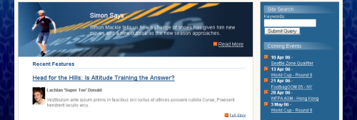
Figure 8.37. Displaying the styled events in the sidebar
The Form
It’s time to create some rules for the search form at the top of the sidebar. Add class="text" to the input type="text"/#ce#/ element, then create a rule for #searchform .text that gives the text box a width of 196 pixels and a border. Here’s the markup:
Example 8.69. styles.css (excerpt)


#searchform .text {

  width: 196px;

  border: 1px solid #45bac0;

}
Apply the searchbutton class to the div that surrounds the submit button, and add a rule for it to styles.css, setting text-align to right and adding a top margin so the button doesn’t bump right up against the text box.
Example 8.70. styles.css (excerpt)


#searchform .searchbutton {

  text-align: right;

  margin-top: 4px;

}
Finally, let’s style the button itself, giving it a border the same color as the text field, a background color that matches the blue used for the background of the sidebar, and a text color of white, as defined in the rules below. You’ll also need to add a class attribute with the value btn to the input element. The results of your work should look like Figure 8.38.
Example 8.71. styles.css (excerpt)


#searchform .btn {

  border: 1px solid #45bac0;

  background-color: #256290;

  color:  white;

}
Figure 8.38. Displaying the styled site search
Move of the Month
The final element of the sidebar that we need to consider is the Move of the Month section at its bottom. This section includes an image; we need to add this to the document first. Insert it below the h4 and give it a class of motm-image:
Example 8.72. index.html (excerpt)


<h3>Move of the Month</h3>

<h4>The Outer Stall</h4>

<img src="img/sidebar-player.gif"

    alt="player demonstrating the outer stall move" height="110"

    width="60" class="motm-image" />

<p>Eti bibendum mauris nec nulla. Nullam cursus ullamcorper quam.

    Sed cursus vestibulum leo.</p>

<p><a href="">more</a></p>
Let’s float this image to the right so that we can display the text to one side of the image:
Example 8.73. styles.css (excerpt)


#sidebar .motm-image {

  float: right;

  margin: 0 30px 0 20px;

}
As you can see, we’ve also added left and right margins to the image. The very last thing we need to do is to format the “more” link, which is very similar to the “Read More” and “Full Story” links in the rest of the layout. However, unlike those links, this link will normally appear next to a floated image. We want to ensure that it doesn’t appear alongside the image: we want it always to display below. So, as you can see in the markup below, we use the clear: right declaration to ensure there are no floated elements to the right of the image. We’ll also need to add the more class to the paragraph that contains the link:
Example 8.74. styles.css (excerpt)


#sidebar p.more {

  clear: right;

  margin: 0 30px 0 0;

  text-align: right;

}
We’ll be looking at clear in more detail in the next chapter. For now, note that it can take the values of left (clearing a left float), right (clearing a right float), and both (clearing both left and right floats). If you’re using floated elements in your layouts, you’ll find this a useful property.
The final rules, below, should be familiar to you from the other “Read More” and “Full Story” links:
Example 8.75. styles.css (excerpt)


#sidebar p.more a:link, #sidebar p.more a:visited {

  color: white;

  background-image: url(img/more-bullet.gif);

  background-repeat: no-repeat;

  background-position: center left;

  padding-left: 14px;

}
This markup completes your two-column layout! The finished page display is shown in Figure 8.39.
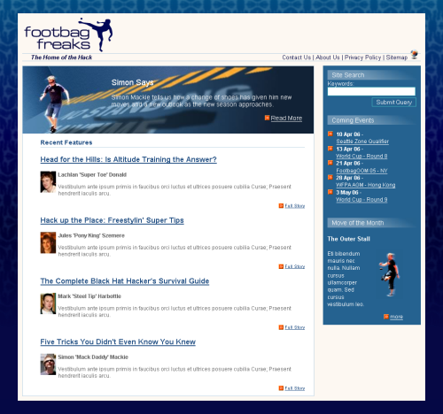
Figure 8.39. The completed two-column layout
Repositioning the Sidebar
We can really start to appreciate the flexibility of CSS layouts when we decide to experiment! For instance, imagine that we want to see how this layout would look if we positioned the sidebar on the left, rather than the right. To do this, you’d need to make only two changes in your CSS.
First, locate the #content rule and change the values for margin: give it a 240-pixel left margin, rather than a 240-pixel right margin. Then, set the right margin to 0:
#content {

  margin: 0 240px 0 0;

  border: 1px solid #b9d2e3;

  background-color: white;

  color: black;

}
Now, find the #sidebar rule and change the positioning declaration right: 0 to left: 0:
Example 8.76. styles.css (excerpt)


#sidebar {

  position: absolute;

  top: 0;

  left: 0;

  width: 220px;

  background-color: #256290;

  color: white;

  margin: 0;

  padding: 0;

}
Save your style sheet and refresh the page in your browser. The sidebar will now appear on the left-hand side of the content, as Figure 8.40 shows.
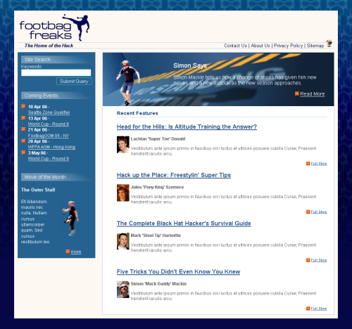
Figure 8.40. Repositioning the sidebar
Summary
We’ve covered a lot in this chapter! We began with an unstyled XHTML document, and after learning a little bit about the theory of using CSS for layout – in particular, absolute and relative positioning, margins, padding, and borders – we began to create a two-column layout using an absolutely positioned sidebar.
You now have a complete page layout that uses CSS positioning; it’s the basic layout used by many of the sites we see on the Web every day. This layout method does have its limitations, though – we’ll discover those, and discuss some alternative layouts, in the next chapter. However, if you need a two-column layout, this structure is robust and can be used as the basis for countless attractive site designs.
That’s it for this excerpt from HTML Utopia: Designing Without Tables Using CSS, but there’s still a lot more to learn! Earlier chapters of this title introduce the basics of CSS, from exploring the parts of a CSS rule, to using selectors, comments, expression measurements and more, to controlling aspects such as colors, fonts, and text effects. Validation of CSS markup is also covered.
Later in the book, you’ll get to develop three-column layouts, fixed-width layouts, “zoom” layouts, and more. The books appendices, which include a CSS color reference, a CSS property reference, and CSS miscellany such as At-rules, are designed to help you as you develop sites using the techniques covered in the book. For more on this title, see the book’s page, and don’t forget: this chapter is available for download in PDF format.
Frequently Asked Questions (FAQs) about CSS Layouts
What are the basic principles of creating rock-solid CSS layouts?
The basic principles of creating rock-solid CSS layouts involve understanding the box model, which is the foundation of CSS layouts. It includes the content box, padding box, border box, and margin box. Another principle is mastering the positioning properties, which include static, relative, absolute, and fixed. Understanding the display property, which controls the layout of elements, is also crucial. It includes block, inline, inline-block, none, and flex.
How can I create a responsive CSS layout?
Creating a responsive CSS layout involves using media queries to adjust the layout based on the screen size. You can also use relative units like percentages instead of fixed units like pixels. Flexbox and Grid are also powerful tools for creating responsive layouts. They allow you to control the alignment, direction, order, and size of boxes.
What are the common problems in CSS layouts and how can I solve them?
Common problems in CSS layouts include overlapping elements, broken layouts, and unresponsive designs. These can be solved by understanding the box model, positioning properties, and display property. Using developer tools to inspect elements and debug your CSS can also be very helpful.
How can I use CSS animations in my layout?
CSS animations can be added to your layout using the animation property. This allows you to create keyframes that define the start, end, and intermediate states of the animation. You can control the duration, timing function, delay, iteration count, direction, fill mode, and play state of the animation.
What is print CSS and how can I use it in my layout?
Print CSS is a type of CSS used for printing web pages. It allows you to control the layout, typography, colors, and other aspects of the printed page. You can use it in your layout by creating a separate CSS file for print or by using media queries to target print.
How can I use CSS preprocessors to improve my layout?
CSS preprocessors like Sass and Less can help you write more maintainable and reusable CSS. They provide features like variables, mixins, nesting, and functions that are not available in regular CSS. You can use them to create more efficient and organized layouts.
How can I use CSS frameworks to speed up my layout development?
CSS frameworks like Bootstrap and Foundation provide pre-written CSS that you can use to quickly create layouts. They include grid systems, typography styles, buttons, forms, and other components. They also provide JavaScript plugins for creating interactive features.
How can I optimize my CSS for better performance?
Optimizing your CSS for better performance involves minimizing the size of your CSS files, using shorthand properties, avoiding unnecessary selectors, and using hardware-accelerated animations. You can also use tools like CSS minifiers and post-processors to automate the optimization process.
How can I make my CSS layout accessible?
Making your CSS layout accessible involves using semantic HTML, providing alternative text for images, using sufficient contrast for text, and ensuring keyboard accessibility. You can also use ARIA roles and properties to improve the accessibility of your layout.
How can I test and debug my CSS layout?
Testing and debugging your CSS layout involves using developer tools to inspect elements, view computed styles, and modify CSS in real-time. You can also use CSS validators to check for errors and warnings. Additionally, testing your layout on different browsers and devices is crucial for ensuring compatibility.
 Dan Shafer and Rachel Andrew
Dan cut his teeth as the first Webmaster and Director of Technology at Salon.com, then spent almost five years as the Master Builder at CNET's Builder.com. Rachel is the Director of edgeofmyseat.com, a Web solutions company in the UK. She has worked on a number of books as a co-author, and is a member of the Web Standards Project, serving on the Dreamweaver Task force. Rachel is the author of SitePoint's The CSS Anthology and Build Your Own Standards Compliant Website Using Dreamweaver 8.