In the first of this two-part series, we looked at how to create a number of Web 2.0 visual effects in Photoshop, including gradients, stripey backgrounds, transparency, reflections, and more.
In this article, we’re going to look at a few more effects: we’ll make objects pop out, fade images, and create starbursts. As with the first article, whenever I mention a tool for which a keyboard shortcut can be used in this tutorial, I’ll indicate that shortcut key in parentheses. If you’re a keyboard junkie, you’ll know that mastering these shortcuts is a real time-saver.
Making Icons and Objects Pop
One of the things that can make a good Web 2.0-style design really stand out is the use of juicy icons and bold, isolated graphics that really pop off the page.
Plenty of cheaply available photo objects and vector icon shapes are available for purchase on the Web. If you’re interested in making your own, though, have a look at my article series, where I show how to use Illustrator to create your own custom icon graphics, as well as my article about isolating objects in Photoshop.
Once you have an icon or object on your page, you can easily apply fun effects to the icon to help make it stand out.
1. Add a reflection, like I’ve done here.
![]()
2. Add a drop shadow by going to the Layers palette, clicking the Add a layer style icon, and choosing Drop Shadow. The settings dialog box will allow you to adjust the opacity, color, direction, size, and distance of the shadow effect, as shown here.
![]()
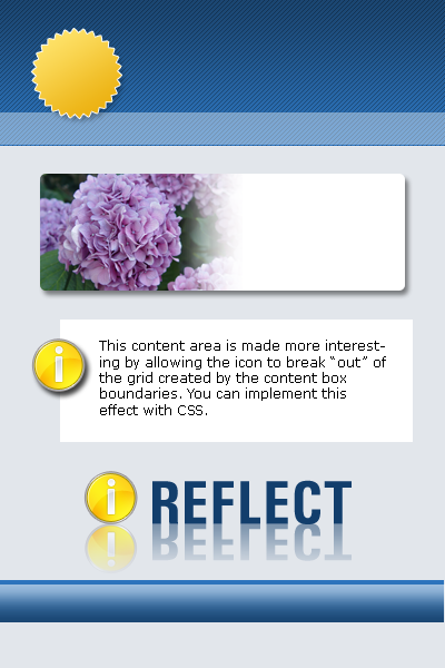
3. Finally, simply positioning the icon so that it breaks the “grid” can make a design more interesting. The example below creates some tension by poking over the edge of its container, which makes the content area more interesting.
![]()
Tip
Make the graphic you use for your icon a transparent PNG, and positing it in your document using CSS positioning. Or for a more “old school” method, create two graphics — one that contains both the grey/white background behind the icon, and one that’s exactly the same size but doesn’t include the icon — and use these two images as background images in your CSS for that section.
Containing an Image to a Specific Shape
On Web 2.0-style sites, splashy photos or illustrations are often used to accent an area of the design. These graphic devices can often be employed in combination with shapes to which other effects have been applied. One of the easiest effects that you can create (other than simply pasting an image into a flat rectangular container) is to contain the image within a specific shape, such as a rounded box.
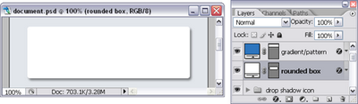
1. In this example, we’ll start with a rounded rectangle that has a drop shadow effect applied to it. Choose the rounded rectangle tool (U), set the radius for the corners, and click and drag to draw the shape. Then, apply the drop shadow layer effect.
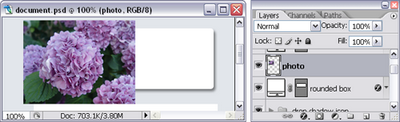
2. Paste the photo or illustration as a new layer immediately above the shape layer, positioning it over the left-hand side of the rounded box, as shown below.
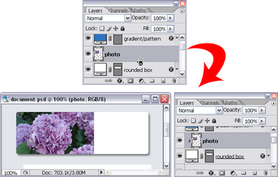
3. In the Layers palette, move the cursor in between the photo layer and the shape layer. Hold the Alt key (Option for Mac), and when the cursor changes to overlapping circles (depicted below), click the mouse button. This creates a “clipping mask” that allows only the parts of the photo layer that overlap the layer below to display.
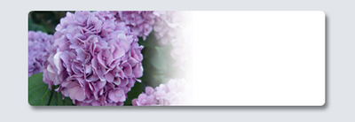
4. You can now move the photo around and it will stay clipped to the box. The final step is to add a layer mask to the photo layer. The result
is shown here.
Creating Starbursts
The last Web 2.0 effect that I’ll cover is the creation of starbursts.
Photoshop comes with a few custom shapes that would work well as starbursts — you can find them by selecting the Custom Shape tool (U), selecting the custom shape drop-down, and selecting the shape that takes your fancy. (You can increase your palette of glyphs by clicking the small arrow in the top right-hand corner and loading more built-in shapes.)
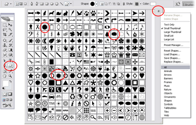
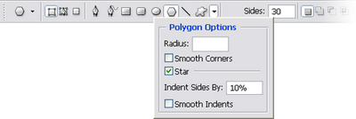
You can also create your own customized starburst by choosing the Polygon tool (U). In the options bar, increase the number of sides (30 works well for me). Then click the little arrow next to the row of shapes to access the Polygon Options. Check Star and choose a small amount for the Indent Sides By field. As you can see below, I chose to use 10%.
Now, draw a shape on the page, and a starburst like the one below will appear!
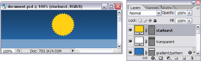
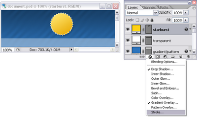
As with any other shape, you can use a combination of other Web 2.0 effects on the starburst. Here are some examples.


Summary
That’s it for now! If you’ve worked through both of these articles, you now know eight different Web 2.0 graphic effects that can be applied to any site — and a host of additional Photoshop wizardry skills that you can mix and match to create those effects.
I’ve created a master document that you can download, which includes all of these effects so that you can pick apart the layers and layer styles to better understand how it’s all done.
If you’re interested in learning more about how to create web graphics with Photoshop, check out The Photoshop Anthology, which contains over 101 tips just like these!
 Corrie Haffly
Corrie is the lead designer and developer for PixelMill. This would-be triathlete has a mathematics degree but wishes she had double-majored in computer science and art instead. Maybe next time...