With all the hype over new and upcoming browser support for advanced CSS features, developers can be confused about the CSS they can include in web projects today. Many of the more advanced features aren’t widely supported by the dominant browsers, but some very useful ones are — including newer features from CSS3.
Every morning when I go through my RSS feeds I glance through news articles, tutorials, and blog postings about the great strides the web standards community has been making, how there’s great browser support on the horizon, and how there’s a huge amount of power built into CSS2.1 and CSS3. This is all true, and it’s fantastic for the Web, but what about me? What about the web developer who reads all this great news, and sits down to implement the new CSS only to find that 90% of users can’t see it because they don’t use a state-of-the-art browser? While all the press is very good, and will ultimately lead to great advances in CSS, accessibility, and the Web in general, it can be hard for a developer to stay grounded. This is the reality of the current state of CSS support.
If you’re like me, as soon as you discover something new in CSS, you immediately want to try it, experiment with it, and see what it can do. But a lot of the time, you discover that support for the particular CSS feature isn’t widespread, and you have to limit yourself to a particular browser to see the new effect. That new knowledge sits on the shelf, and you end up forgetting about it because you can’t really use it on a large scale in your everyday development tasks. This sort of thing happens all the time.
Which Browsers Should Guide Your Decisions About CSS?
A number of browsers are available right now, some of which are very standards compliant, some aren’t. Each works off a rendering engine that translates your code into what you see when you visit a web page. So, how do you know which ones to adapt your development strategies to?
The most popular web browsers are currently Internet Explorer 6, Internet Explorer 7, Firefox, and Safari. I call them “the big four” — they’re the browsers I use to make my development decisions. My testing suite includes a few more browsers, but I make choices about CSS usage based on the big four.
Advanced CSS You Can Use with Confidence
When you’re choosing to use advanced CSS features, the considerations you take into account will extend beyond the availability of browser support, because you’re not going to have default support for everything you want to use (if you did, there wouldn’t be much of a decision to make). The list below outlines the criteria I used to choose each of the CSS features displayed in the table below.
- Does the feature have enough browser support to justify its use?
- Is the feature useful?
- What happens if a browser doesn’t support it? If a browser doesn’t support the feature, will it degrade gracefully (that is, will it degrade without causing display problems)?
- Does it help to make the job of writing semantic markup easier?
If you answered yes, yes, yes, and yes to these questions, you may feel confident to go for it. This table lists the advanced CSS features you can use right now.
| IE6 | IE7 | Firefox | Safari | |
|---|---|---|---|---|
| Attribute selectors | No | Yes | Yes | Yes |
| Child selector | No | Yes | Yes | Yes |
| :first-child pseudo-class | No | Yes | Yes | Yes |
| :first-line pseudo-element | Yes | Yes | Yes | Yes |
| :first-letter pseudo-element | Yes | Yes | Yes | Yes |
| Multi-column layout | No | No | Yes | Yes |
| Border Radius | No | No | Yes | Yes |
| :target | No | No | Yes | Yes |
Let’s step through this table, discussing each of the features in more detail.
You can use seven different operators with an attribute selector. All of them are supported in some form (buggy or fully) by IE7, Firefox, and Safari, and can be considered “safe” to use. Attribute selectors are among the most useful of components of advanced CSS, as they allow you to selectively apply CSS to elements using common HTML attributes, rather than having to use extra HTML markup.
Operator: none
Description: Using an attribute selector with no operator will select all the elements that contain that attribute. In this example, the CSS rule will color any link element with a rel attribute orange, and remove its underline. (CSS 2.1)
CSS:
a[rel] {
  color: orange;
  text-decoration: none;
}
HTML:
<a href="http://www.example.com" rel="external">dolor</a>
Operator: =
Description: Using the equals sign as an operator will allow the selector to match an element with the given value of an attribute. In this case, all links with rel=”external” will be appended with an icon indicating an externally linked web site. (CSS 2.1)
CSS:
a[rel="external"] {
  padding: 0 20px 0 0;
  background: #fff url(icon_external-site.gif) no-repeat right center;
}
HTML:
<a href="http://www.example.com" rel="external">dolor</a>
Operator: ~=
Description: This operator allows the selector to match elements with an attribute that contains a space-separated list of words in which the specified value is present. In this case, the link is a rel value of “external friend tag” and we want to show it as an external link, ignoring the other values. This selector is also useful for selecting elements on the basis of their class values when you’re using multiple classes on elements. (CSS 2.1)
CSS:
a[rel~="external"] {
  padding: 0 20px 0 0;
  background: #fff url(icon_external-site.gif) no-repeat right center;
}
HTML:
<a href="http://www.example.com" rel="external friend tag">dolor</a>
Operator: |=
Description: Using the vertical line operator will allow the selector to match elements whose attribute values form a hyphenated list of words in which the specified value is present. This operator is primarily intended for the lang attribute. The following CSS will select a link element with a lang attribute value that contains en- and place an American flag after it. (CSS 2.1)
CSS:
a[lang|="en"] {
  padding: 0 20px 0 0;
  background: #fff url(icon_lang-en.gif) no-repeat right center;
}
HTML:
<a href="http://www.example.com" lang="en-US">target link</a>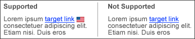
Operator: ^=
Description: Using the caret operator will allow the selector to match all elements that have an attribute that begins with the specified value. The following CSS will grab any link that has an href attribute value that starts with http, and place an icon after it. This example shows how useful this selector is for highlighting external or absolute links on your site. (CSS3)
CSS:
a[href^="http"] {
  padding: 0 20px 0 0;
  background: #fff url(icon_external-site.gif) no-repeat right center;
}
HTML:
<a href="http://www.sitepoint.com">SitePoint</a>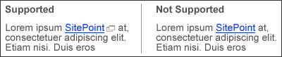
Operator: $=
Description: Using the dollar sign operator is useful when you want to target the last characters of an attribute (such as a file extension… hint, hint!). This example will select any link to a .pdf file, and place a PDF icon after it. (CSS3)
CSS:
a[href$=".pdf"] {
  padding: 0 20px 0 0;
  background: #fff url(icon_pdf.gif) no-repeat right center;
}
HTML:
<a href="file.pdf">target link</a>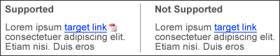
Operator: *=
Description: Using the *= operator will allow the selector to target any element that has an attribute that contains the value at any point. The following CSS will apply the rule to any link with a title attribute that contains the pattern “home”. (CSS3)
CSS:
a[title*="Home"] {
  padding: 0 0 0 20px;
  background: #fff url(icon_home.gif) no-repeat left center;
}
HTML:
<a href="index.html" title="Home link">Home</a>
Child selector
Description: The child selector matches elements when the second element specified is a direct child of the first. In this example, all <strong> tags in a list item will be red, bold (the default behavior), and italic.
HTML:
<li>This is the <strong>example</strong> text</li>
CSS:
li > strong {
color: red;
font-style: italic;
}
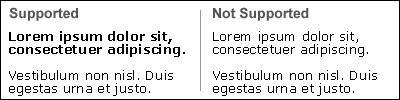
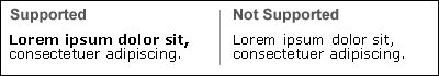
:first-child pseudo-class
Description: The first-child pseudo-class can be very helpful in highlighting the first paragraph of an article.
HTML:
<p>Lorem ipsum dolor sit, consectetuer adipiscing.</p>
<p>Vestibulum non nisl. Duis egestas urna et justo.</p>
CSS:
p:first-child {
font-weight: 700;
}
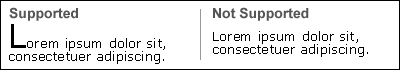
:first-line pseudo-element
Description: Use the first-line pseudo-element to apply CSS to the first line of text within the selected element. In an EM-unit or percentage-based layout, the number of bolded words will change as the page width changes. In this case, the first line of the paragraph will have a font-weight of 700 (bold).
HTML:
<p>Lorem ipsum dolor sit, consectetuer adipiscing.</p>
CSS:
p:first-line {
font-weight: 700;
}
:first-letter pseudo-element
Description: The first-letter pseudo-element allows you to specify the CSS to be applied to the first letter of an element. In this example, the first letter of the paragraph will be larger, creating a drop-cap effect.
HTML:
<p>Lorem ipsum dolor sit, consectetuer adipiscing.</p>
CSS:
p:first-letter {
font-size: 2em;
}
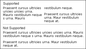
Multi-column layout (on internal content)
Description: The CSS3 multi-column layout properties seem to be the most useful for online publications, news articles, and internal page content. Since they’re not yet widely supported, they’re not recommended for use in major layout elements of a page. However, they can be used to reduce markup and make text more readable by shortening column width and page length. For an auto-width column, a column-count declaration can be used, and for a set column width, a column-width declaration can be used.
Because this function isn’t fully supported, we need to use rendering-engine-specific prefixes to target Firefox (-moz-) and Safari (-webkit-). We use the third declaration without a prefix as a form of progressive enhancement for future browsers; it’s placed at the bottom of the list so that when multi-column is fully supported, the prefixed declarations will be overridden. In this case, there will be two columns with a 1em gap between them.
XHTML:
<div id="content">
  <p>Praesent cursus ultricies uricies uricies urna. Mauris vestibulum neque s urna. Mauris vestibulum neque.</p>
  <p>Praesent cursus ultricies urna. Maur vestibulum neque at.</p>
</div>
CSS:
#content {
/*gecko*/
-moz-column-count: 2;
-moz-column-gap: 1em;
/*webkit*/
-webkit-column-count: 2;
-webkit-column-gap: 1em;
/*future proofing*/
column-count: 2;
column-gap: 1em;
}
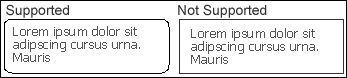
Border Radius
Description: The border radius properties solve the age-old problem of displaying rounded corners without using images. The image below is a rendering in Firefox 2.00.12, but in the latest version of Safari and Firefox 3 Beta 3, the radius lines render much more cleanly. The only negative aspect of border radius is that if you use a background image it will show on the outside of the boundaries of the rounded corners, so you may need to design your background images with that in mind. There’s a multiple background image CSS3 property that can deal with this too, but it isn’t supported by any browser (that I know of) yet.
Specific corners can also be given individual properties like: border-radius-topleft: 1em;.
XHTML:
<div id="sidebar">Lorem ipsum dolor sit amet, consectetuer adipiscing elit. Suspendisse ut odio eu nisi rutrum euismod.</div>
CSS:
#sidebar {
padding: 1em;
border: 1px solid #333;
/*gecko*/
-moz-border-radius: 1em;
/*webkit*/
-webkit-border-radius: 1em;
/*future proofing*/
border-radius: 1em;
}
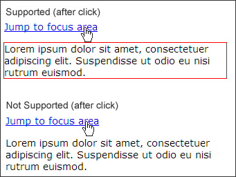
:target pseudo-class
Description: The target pseudo-class is very useful in drawing the user’s eye to a specific area of the page when you’re using anchors. In this example, after the user clicks the anchor link, the corresponding text will be highlighted with a red border. This is similar to the Yellow Fade Technique.
XHTML:
<a href="#focusarea">Jump to focus area</a>
<p id="focusarea">Lorem ipsum dolor sit amet, consectetuer adipiscing elit. Suspendisse ut odio eu nisi rutrum euismod.</p>
CSS:
p#focusarea:target {
border: 1px solid red;
}
Some of these advanced selectors, pseudo-classes and elements, and other nifty tricks are part of the CSS 2.1 specification, while others are CSS3. I found them all useful, and they can all be used without hiding vital content while significantly enhancing the user experience. Generally speaking, content is the most important element in any web page — it’s why people visit. Adding in a rich user experience with these simple CSS enhancements will increase the usability of your site and can make users come back time and time again.
Options for the Non-compliant Browser
Progressive Enhancement
Progressive enhancement is a very important part of using advanced CSS. You can avoid problems with non-compliant browsers by taking a layered approach to development:
-
- Layer 1 is your content and document structure (HTML).
-
- Layer 2 is your presentation (CSS).
- Layer 3 is any behavior you want to add (advanced CSS and JavaScript).
First, focus on getting layers one and two right — to ensure a decent base-level experience for all users, no matter which browser they use. Once the core development is finished, you can safely add advanced CSS features to enhance the user experience for visitors who use supportive browsers, knowing that the most important elements will always be available to all.
Filling in the Gaps with JavaScript
There are some great JavaScript libraries available to help IE6 achieve more standards-compliant behaviour. In some cases, it can end up being more compliant than its upgraded companion, IE7.
Back before IE7 was released, Dean Edwards created a script called “ie7”. This is a package of JavaScript files that deals with a variety of compliance issues in IE6. These files can be downloaded from Google Code, and you can find additional information on the Dean Edwards ie7 page. These files tend to be a little heavy, but work very well, and you can pick the ones you want to use based on your own needs.
Another script that you can use to help work around non-compliant browsers is jQuery. JQuery’s prepend method can be used to insert client-side elements into your markup, and you can style them accordingly. This will create more CSS, but may be a good solution if you’re already using jQuery.
One more solid option is Alex Bischoff’s offspring.js on A List Apart. Offspring.js adds pseudo-classes automatically via DOM scripting. It also allows you to use CSS3 selectors, such as :nth-child(), that aren’t normally available. While IE6 has the most to gain from this script, all current browsers will reap the benefits.
Trust Your Own Experience
I feel like the guy from Reading Rainbow saying “don’t take my word for it”, but… don’t take my word for it! Make sure you do your own research. I have stats on browser usage on my personal web site, SitePoint has its own stats, and so do you; the majority of your front-end development decisions should be based on the people who visit your site. Every web site will have different trends and demographics to guide development strategies. You should track your visitors and create a regular schedule for reviewing your statistics (I look over mine about once a month). These review can be very helpful over a period of time. Wouldn’t you want to know the instant your users start upgrading their browsers?
Personally, I’ve used Google Analytics and StatCounter to analyze my site traffic. Either one will get the job done. Google Analytics is a more comprehensive program with extremely in-depth data analysis. StatCounter provides more general information, but it’s very relevant and useful.
Enjoying the Benefits of Advanced CSS
Some of the best publications I’ve read have answered the question: “Why?” Why should I use advanced CSS techniques when I can accomplish the same effect by adding in an extra class, ID, span, or div, or by using JavaScript?
The answer is very simple: you can do more with less code. With browsers evolving very rapidly in recent years, CSS support is improving. By having to use a minimal amount of markup, you can safeguard your site against browser updates and changes, and vastly increase accessibility with very little effort.
These techniques will cut down on the amount of HTML and CSS you need to use to complete the layout you desire. There will always be a hundred different ways to do something on the web; if you use advanced CSS, you can do them with less markup and create lighter, more usable, accessible web sites.
References
 Tim Wright
Tim has been a web developer and web standards fanatic since 2004. He currently runs CSSKarma and keeps all his project notes in a book labeled "Stories of a CSS Ninja." Tim dies a little inside everytime he sees a table-based layout.