Nothing says Web 2.0 more than a shiny button. Of course, the “shiny plastic” look-and-feel is not for everyone, but good-looking navigation buttons are still integral to the design of a sexy web page. In this first instalment of a two-part article, I’ll show you how to create a wide variety of different buttons using Adobe Photoshop.
First we’ll look at how to create a basic button. Then you’ll apply to it all manner of effects: outlines, bevels, chisels, gradients, wet matte effects, and more!
This article has been excerpted from my book The Photoshop Anthology: 101 Web Design Tips, Tricks & Techniques, which is available for a limited time as a free PDF download, thanks to our sponsor, 99designs.
That’s right — the whole book can be downloaded for FREE.
The techniques you’ll learn here can be applied to any “button-like” object, including icons, bullets, title and navigation bars, and other page accents.
Even if you’re a graphics novice, this is fun stuff. Let’s get started!
Making a Simple, Flat Button
Solution
Rectangular Flat Button
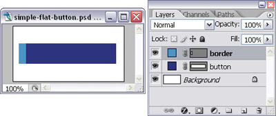
First we’re going to draw a basic, rectangular button. Set the foreground color to a color of your choice, then draw a rectangle with the Rectangle Tool (U).
I told you it was basic! I’ve made mine more interesting by drawing another rectangle in a lighter color to give my button a thick border on its left-hand side, as shown here.
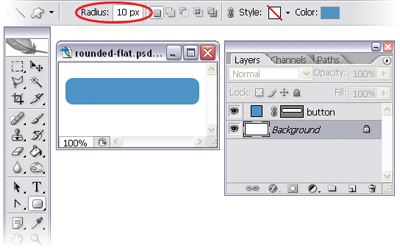
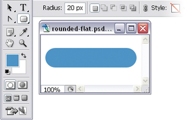
Rounded Flat Button
You can also create basic, rectangular buttons with rounded corners using — you guessed it — the Rounded Rectangle Tool (U). Alter the “roundness” of your corners using the Radius field in the options bar, as shown here.
NOTE: Photoshop Doesn’t Replace CSS
On a web page, you’d probably use CSS instead of images to achieve this rectangular button effect. However, this technique is handy when it comes to drawing simple buttons for web comps in Photoshop.
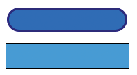
Adding an Outline to a Button
In this solution, we’re going to be adding outlines to our basic buttons to make them look like the ones shown here.
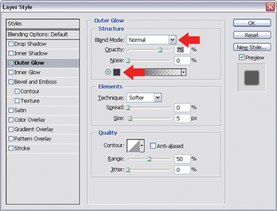
NOTE: Adding Layer Styles
In this chapter and beyond, we’ll be making heavy use of layer styles, which are applied by launching the Layer Style window. There are a few different ways to launch this window, but the one I use most often is to click on the little f button at the bottom of the layer palette, as shown here.
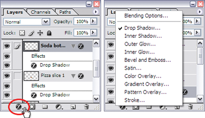
Clicking this button will display a dialog listing all of the different layer styles available. Simply choose the one you want and the Layer Style window will launch, with the specific effect selected. It’s also possible to select the same styles from the menu bar (Layer > Layer Style), but using the icon saves you one mouse click!
Solution
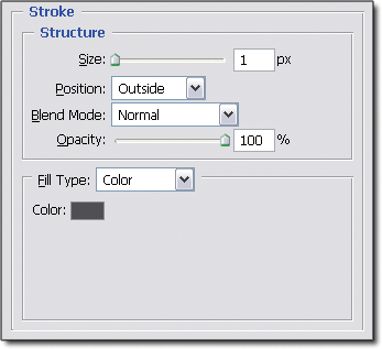
Let’s add outlines to the basic buttons we created earlier. Select the layer that contains your button. Open the Layer Style dialog by clicking on the Add a layer style button at the bottom of the Layers palette and selecting Stroke… from the menu that appears. You’ll see that the Stroke style is checked and highlighted — this adds the outline to your button. Change the look of your stroke by adjusting the settings.
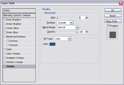
You can see from the dialog shown above that I gave mine a black outline by clicking on the color patch and setting the color to black, and gave it a thickness of one pixel by typing 1 into the Size field (you could also use the slider to adjust the size of the stroke).
Making a Smooth, Beveled Button
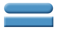
They’re getting fancier! Let’s have a go at creating the beveled buttons shown here.
Solution
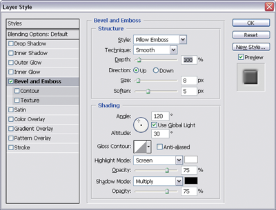
By now, you should be an expert in creating basic, rectangular buttons. Just as well, because you’ll need one for this solution! Create or select your basic button. Open the Layer Style dialog by clicking on the Add a layer style button at the bottom of the Layers palette and selecting Bevel and Emboss… from the menu that appears. You’ve just added a bevel to your button. You can give the bevel a more rounded appearance by increasing the Size and Soften levels. I’m using 7px for Size and 8px for Soften, as shown in this image.
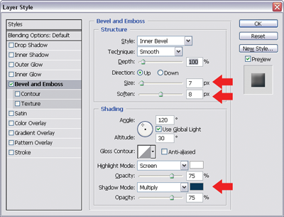
Make the effect more subtle by changing the Shadow Mode color. Since my button is blue, I’ve changed the Shadow Mode color from black to blue (a slightly darker shade than my button color).
Creating a Chiseled Button Effect
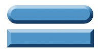
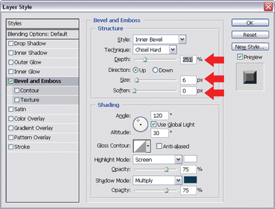
The Bevel and Emboss layer style is a versatile tool that can be used to create many different button effects. In this solution, we’ll use it to create hard-edged, chiseled buttons like the ones shown here.
Solution
Create or select a basic button. Then, open the Layer Style dialog by clicking on the Add a layer style button at the bottom of the Layers palette and selecting Bevel and Emboss… from the menu that appears. From the Technique drop-down, select Chisel Hard and set the Soften field to 0px. Increase the Depth of the bevel to chisel “deeper” into the button.
Creating an Embedded Button Effect
In this solution, I’ll show you a button effect that makes your buttons look like they’re embedded into the page, as shown here.
Solution
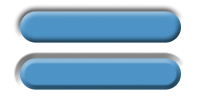
Select or create a basic button. Open the Layer Style dialog by clicking on the Add a layer style button at the bottom of the Layers palette and selecting Bevel and Emboss… from the menu that appears. From the Style drop-down, select Pillow Emboss — this will give your button an “embedded” effect.
Experiment with the settings to change the look of your effect. Both the buttons in the example shown above are pillow embossed, but they look different because I’ve set the Technique to Smooth for the top one, and Chisel Hard for the bottom one.
Making a Gradient Button
Two-toned gradient buttons like the ones shown here are the new black of graphic design. This effect has become increasingly popular — no doubt you’ll have seen it used on the buttons, menu rows, and heading backgrounds of trendy web sites. In this solution, I’ll show you how easy it is to create your very own gradient buttons.
Solution
Raster Buttons
Using a selection tool, such as the Marquee Tool (M), create a rectangular selection for your button. Set the foreground and background colors to the two tones you want in your gradient, and create a new layer. With the Gradient Tool (G) selected, choose the Foreground to Background gradient option and click and drag the mouse to fill in your selection. (Holding down Shift will constrain the gradient direction to a horizontal or vertical line.)
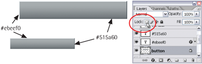
We can achieve the same gradient button effect using the Lock Transparent Pixels option that’s provided for layers. This option is useful for rounded rectangles or other shapes for which we’re not provided with automatic selection tools.
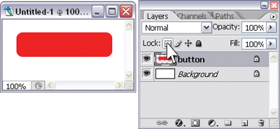
Let’s use it to make a rounded rectangle button. Using the Rounded Rectangle Tool(U) with the Fill Pixels option selected, create a solid-colored raster button on a new layer. Click the Lock Transparent Pixels icon in the Layers palette, as shown in the example above. Then, set the foreground and background colors to your gradient tones and apply the gradient. Since you’ve locked the transparent pixels, the gradient will be applied only to non-transparent elements in the layer: your button, in this case.
WARNING: Useful, but Not Terribly Usable!
For all its power, the Layer Style dialog is amazingly unintuitive. What I find most confusing is the fact that you can apply a style without selecting it!
That’s right — once you’ve launched the Layer Style dialog, you can apply a style (with Photoshop’s default settings) by checking its checkbox. If you have the Preview checkbox ticked, you’ll see the effect this style has on your image. Fairly straightforward, right? But what’s confusing is that this doesn’t actually select the style, so you can’t change its settings! You need to highlight the name of the style to bring these up – simply checking the checkbox won’t do!
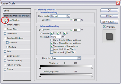
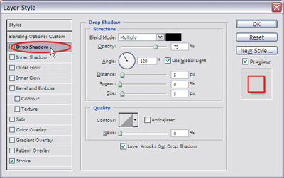
The example shown here demonstrates this: In the top image I’ve checked the Drop Shadow style, which has been applied, but the settings in the dialog box are for the layer’s Blending Options. This means I can’t make any changes to my drop shadow!If I click on the name of the layer style instead, my drop shadow is applied and its settings are displayed (as shown in the second image). Because of this, you might think that if I click on the name of another style that I’ve applied, it will be turned off in the document. That’s not the case — you’ll have to uncheck the checkbox for that! I’d suggest you spend a minute selecting and applying a few different layer styles until you get the hang of how it all works – it’ll save you from confusion later on!
Vector Buttons
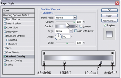
If you’re not happy making raster buttons, you can create vector shapes and apply the gradient effect to them. Open the Layer Style dialog by clicking on the Add a layer style button at the bottom of the Layers palette and selecting Gradient Overlay… from the menu that appears. The gradient overlay options will be displayed.
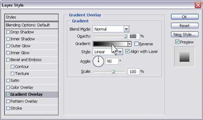
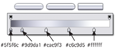
Adjust your gradient by clicking on the Gradient patch in the Layer Style dialog. This will bring up another dialog, the Gradient Editor, shown here, which you can use to set your gradient options.
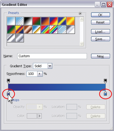
The colors of your gradient are represented in tiny color patches underneath the gradient bar. Double-click on them to bring up the Color Picker — you can use this to change the color of the patch (and consequently, your gradient). Add more colors by clicking anywhere along the bottom of the gradient bar — a new color patch will be placed there.
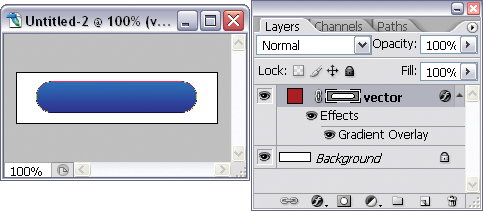
Click OK in both dialogs, and voila! You’ve got your two-toned gradient button. And because we’ve “overlaid” our gradient onto our button, the original color of the button is inconsequential!
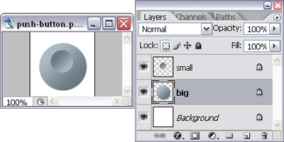
Making a Round Push-button
In this solution, we’ll call on the trusty gradient button-creating skills we learned in the solution “Making a Gradient Button” to make a round push-button like the one shown here.

Solution
- Create a circular gradient button on a new layer.
- On another layer, create a circular gradient button that’s a bit smaller than the first. The direction of the gradient on this button should be the opposite to that of the first button — in this example, my big circle has a white-to-gray diagonal gradient and my small circle has a dark-to-light diagonal gradient. (Don’t be too concerned about lining the shapes up just yet.)
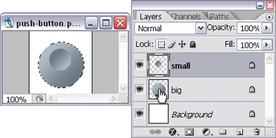
Your push-button is complete!
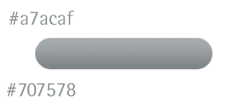
Making a Metallic Button with a Matte Finish
More buttons that use gradients! Just as well we brushed up on our gradient button-making skills in “Making a Gradient Button”. We’re going to make matte-finish metallic buttons like the ones shown here.
Solution
Rectangular, Matte-finish, Metallic Button
- First, create a simple raster gradient button. I’m going to use two different shades of gray for mine.
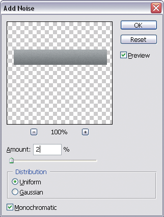
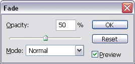
NOTE: Use Fade Promptly!
To use the Fade command on a filter, you’ll need to do so immediately after the filter has been applied — otherwise it won’t be available.
Now we’re happy! Here’s our finished button.
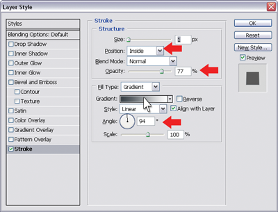
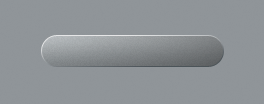
Rounded, Matte-finish Metallic Button
Creating a rounded matte-finish button is pretty much the same as creating a rectangular one. The main difference is that we’re going to use a stroke layer effect to add the borders, since it’s going to be difficult for us to draw the borders accurately by hand.
- Create a rounded gradient button. I used the same shades of gray I used for the rectangular button in the previous solution.
- Size: 1px
- Position: Inside
- Opacity: 75%
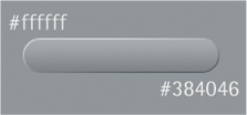
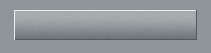
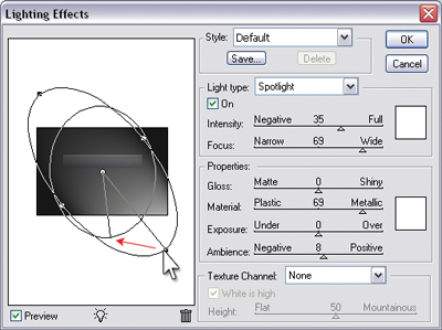
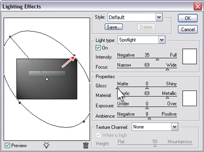
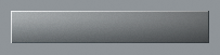
Making a Shiny Metallic Button
Here, I’m going to show you how to create shiny, metallic buttons like the ones shown here. I’ll also show you how you can vary their appearance using different settings.
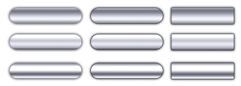
Solution
- Create a raster or vector button. I’ve created both a rounded and a rectangular button in this example. The color of the button is unimportant, as it won’t affect the final result.
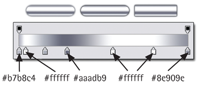
Variations
You can vary the appearance of your shiny button by playing with the gradient editor settings. The examples below show how the look of our shiny button changed when different gradient configurations were applied.
Summary
And with this cliffhanger, I’ll leave you for the time being to keep playing with the navigation button solutions I’ve shown you. Watch this space! Further secrets of beautiful button creation will be revealed in Part II, to be published in this column in a couple of weeks. In the meantime, don’t forget to check out the free PDF download, courtesy of 99designs.com.
Frequently Asked Questions about Building Buttons in Photoshop
How can I create a 3D button effect in Photoshop?
Creating a 3D button effect in Photoshop involves using layer styles and blending options. Start by creating a new layer and drawing a shape for your button. Then, go to the Layer menu, select Layer Style, and then Blending Options. Here, you can add a gradient overlay to give your button a 3D effect. You can also add a drop shadow and bevel and emboss effects to enhance the 3D look. Remember to experiment with the settings to achieve the desired effect.
How can I create a modern web UI button in Photoshop?
To create a modern web UI button, you need to focus on simplicity and clarity. Start by creating a new layer and drawing a rectangle with rounded corners. Then, add a gradient overlay to give it a sleek look. You can also add a stroke to make the button stand out. Finally, add your text and adjust its size and position to fit perfectly within the button.
How long does it take to create a button in Photoshop?
The time it takes to create a button in Photoshop can vary depending on the complexity of the design. However, with practice, you can create a simple button in about 15 minutes. More complex designs, such as 3D buttons or buttons with intricate details, may take longer.
Can I create a button in Photoshop without any design experience?
Yes, you can create a button in Photoshop even if you don’t have any design experience. Photoshop is a user-friendly tool that offers a variety of features and options to help you create professional-looking designs. There are also numerous tutorials and resources available online to guide you through the process.
How can I add text to a button in Photoshop?
To add text to a button in Photoshop, select the Text tool from the toolbar, click on the button where you want to add the text, and start typing. You can adjust the font, size, color, and alignment of the text using the options bar at the top of the screen.
How can I create a button with a glossy effect in Photoshop?
To create a button with a glossy effect, you can use the Gradient Overlay layer style. After creating your button shape, go to the Layer menu, select Layer Style, and then Gradient Overlay. Choose a gradient that goes from light to dark to create the glossy effect. You can also adjust the angle and scale of the gradient to achieve the desired look.
Can I use Photoshop to create buttons for my website?
Yes, you can use Photoshop to create buttons for your website. Photoshop allows you to create custom buttons in any shape, size, and color. You can also add text, images, and effects to your buttons. Once you’ve created your buttons, you can save them as image files and use them on your website.
How can I create a button with a hover effect in Photoshop?
While Photoshop itself doesn’t support interactive features like hover effects, you can create two versions of a button – one for the normal state and one for the hover state. Then, you can use CSS to switch between the two versions when the user hovers over the button on your website.
How can I create a button with an icon in Photoshop?
To create a button with an icon, first create your button shape. Then, open the icon image in Photoshop, copy it, and paste it onto a new layer above the button layer. You can resize and position the icon using the Transform tool. Finally, adjust the opacity of the icon layer to make it blend well with the button.
How can I save my button design in Photoshop?
To save your button design in Photoshop, go to the File menu and select Save As. Choose a location to save your file, and select a format from the Format drop-down menu. If you’re planning to use the button on a website, it’s best to save it as a JPEG or PNG file.
 Corrie Haffly
Corrie is the lead designer and developer for PixelMill. This would-be triathlete has a mathematics degree but wishes she had double-majored in computer science and art instead. Maybe next time...